
Grand Touring
Automobiles
Redesigning a Luxury Automotive Shopping Experience
Role: Product Designer, User Experience (UX) Design, User Interface (UI)
Scope: User research and stakeholder interviews, Competitive and market research, Information architecture and navigation, UX strategy and interaction design, Inventory and vehicle discovery, Comparison experience, Service booking flow, UI and visual design, Responsive design, Accessibility considerations, Design system and UI kit, Usability testing and iteration
Duration: 1 year
Tools: Figma, LucidCharts, Photoshop, Illustrator
Grand Touring Automobiles (GTA) is a Toronto-based luxury automotive dealership representing brands including Aston Martin, Bentley, and Bugatti.
I led the redesign of GTA's digital experience, transforming an outdated dealership website into a more modern platform for discovering brands, browsing new and pre-owned inventory, researching vehicles, comparing options, and booking services.
The challenge was to bring the digital experience closer to the level of the physical showroom while making a complex inventory and service offering easier to navigate.
-
![]()
1. Homepage
-
![]()
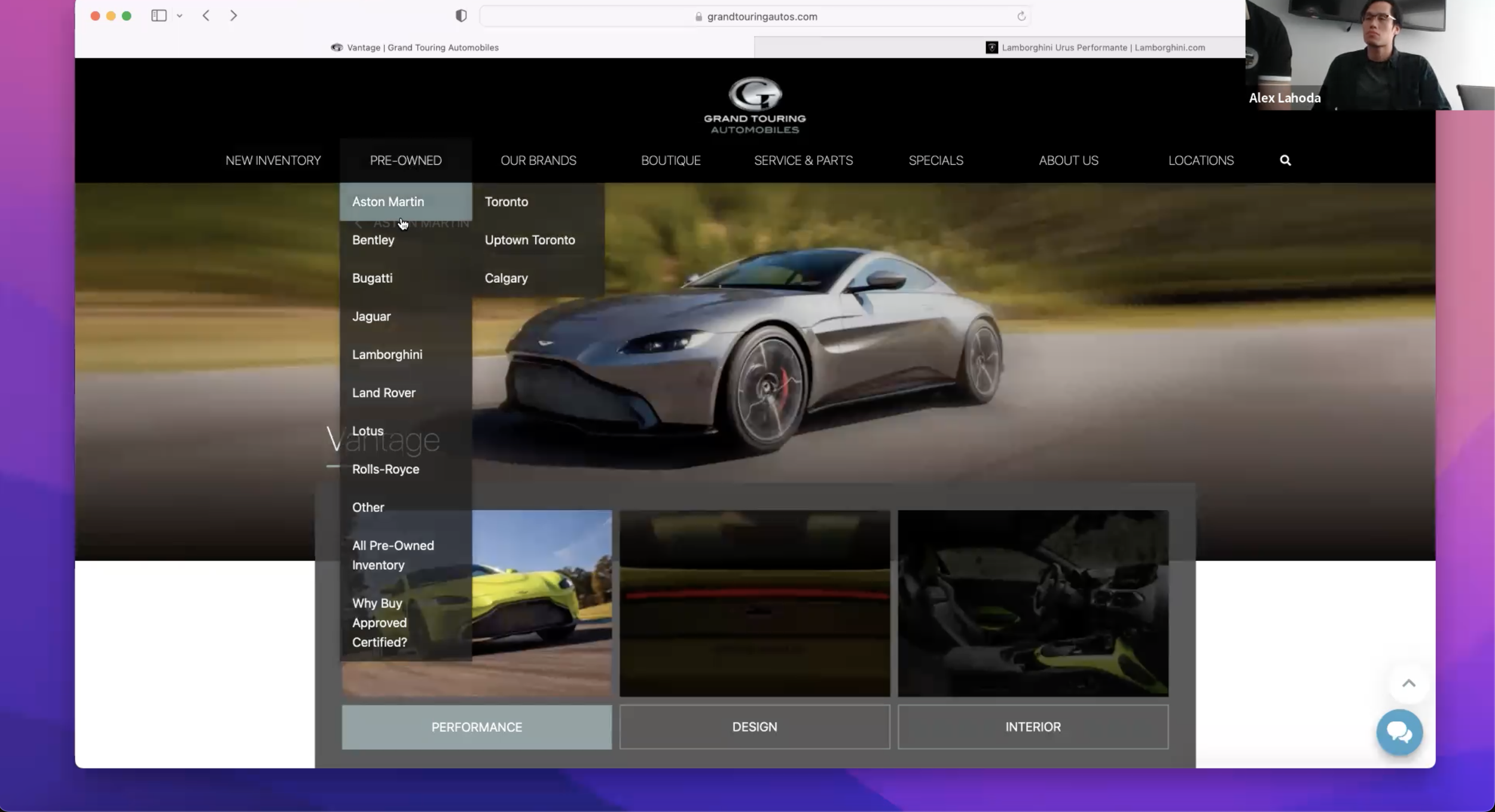
2. Navigation System
-
![]()
3. Brand Page
-
![]()
4. Brand Page (Displaying Vehicle Info)
-
![]()
5. Brand Page (Lower down the page)
-
![]()
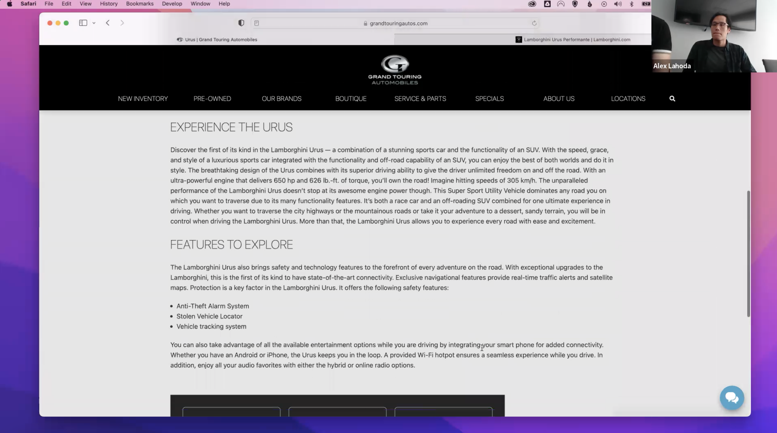
6. Vehicle Details
-
![]()
7. Vehicle Details (Lower down the page)
-
![]()
8. Vehicle Listings of Specific Brand
-
![]()
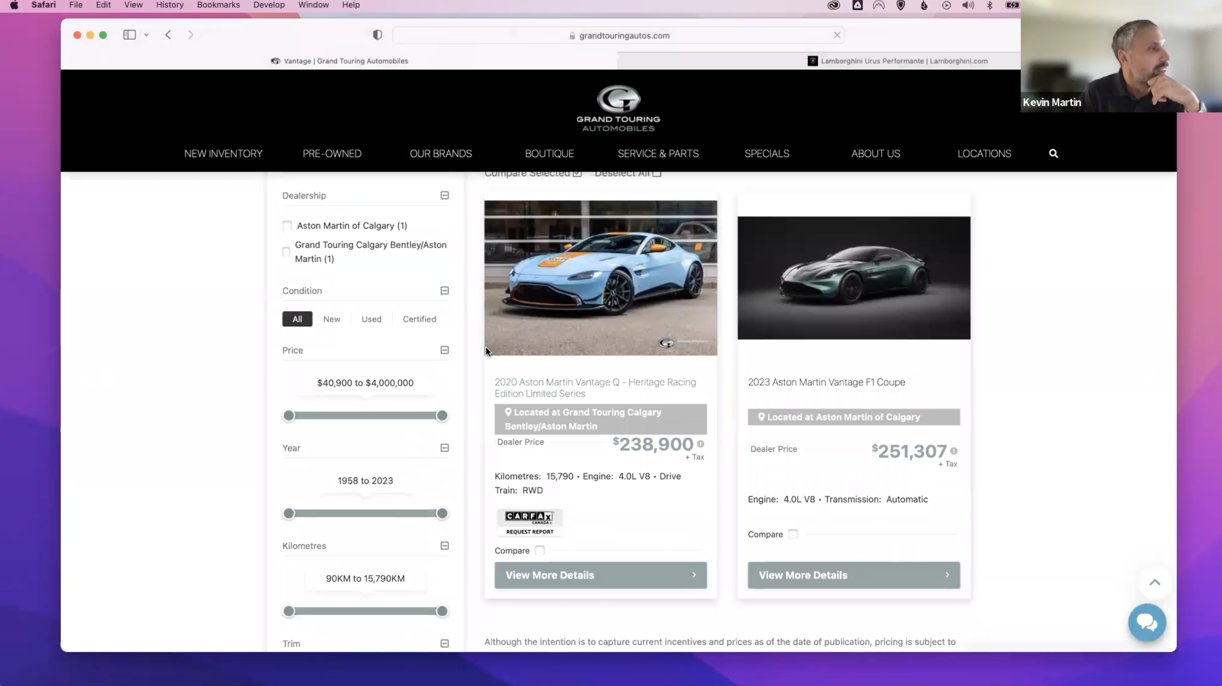
9. Vehicle Listings (Used)





The Challenge
GTA's existing website was constrained by an outdated platform and a navigation structure that had grown increasingly complex. The experience made it difficult for customers to move naturally between brands, inventory, vehicle information, and services.
Through user interviews, competitor research, and an audit of the existing experience, I identified several key areas that needed to be addressed.
Navigation had become overly complex.
Brand-specific sections were repeated throughout the navigation, forcing customers to navigate through multiple layers to find inventory or information about a particular brand.
Inventory discovery was disconnected from the dealership's actual offering.
The existing search experience relied on a generic search that could return results outside GTA's available inventory. Customers needed a more focused way to discover vehicles that were actually available through the dealership.
Comparing vehicles lacked clarity.
The existing comparison experience made it difficult to understand differences between vehicles. Selection feedback was also limited, leaving customers uncertain about whether vehicles had been added successfully.
Service booking required unnecessary complexity.
Booking a service appointment required customers to navigate different locations and requirements depending on the vehicle brand. The challenge was to simplify this without hiding important information or presenting customers with irrelevant choices.

My Approach
Simplifying the Way Customers Navigate GTA
I restructured the site's information architecture around how customers actually browse the dealership.
Instead of repeating brands across multiple navigation sections, brands became a central entry point into the experience, while new and pre-owned inventory were consolidated into a unified inventory structure.
The result was a simpler navigation model with fewer repeated paths and more room for the vehicle content itself to take center stage.
Making Inventory Easier to Discover
I redesigned search and inventory browsing around GTA's actual vehicle inventory.
Search results were scoped to available new and pre-owned vehicles and surfaced the information customers needed to identify a vehicle quickly, including imagery, model, year, and price.
Inventory pages were also designed to support filtering and exploration without overwhelming the customer with unnecessary information.
Creating a More Useful Comparison Experience
The vehicle comparison experience was redesigned to make selection and comparison more intuitive.
Customers receive immediate visual feedback when adding a vehicle to compare, while a persistent action bar allows them to review their selections without losing their place in the inventory.
The comparison view organizes vehicle specifications into an expandable structure, allowing customers to compare multiple vehicles while maintaining access to detailed information.
Designing Service Booking Around Relevant Choices
The service appointment flow presented a different challenge: the available service locations depended on the customer's vehicle brand.
Rather than presenting every possible location in a large form, I designed the flow so that customers first select their vehicle brand, after which only the relevant service locations are presented.
This reduced unnecessary choices while ensuring the information shown at each step was relevant to the customer's selection.
Building a Premium Digital Experience
The visual direction was designed to reflect the positioning of GTA's brands without competing with the vehicles themselves.
I used an editorial approach to layout, giving imagery and typography more space and reducing unnecessary visual noise. Subtle motion and transitions were introduced to create a sense of movement while maintaining a restrained, premium feel.
The design also considered responsive behavior and WCAG AA accessibility requirements to ensure the experience remained usable across devices and audiences.

The Outcome
The redesign transformed GTA's website from a fragmented dealership experience into a more cohesive digital showroom.
Customers gained a clearer way to navigate brands, discover available vehicles, compare options, and book services, while GTA gained a more flexible platform capable of supporting its inventory and broader digital experience.
The work balanced two competing requirements: making a complex automotive marketplace easier to use while creating a digital experience that felt appropriate for the luxury brands GTA represented.
