
POCUS Checklist
Improving a Clinical Training Platform Across Multiple User Roles
Role: Lead Product Designer & Product Manager
Scope: User and stakeholder interviews, Product and workflow analysis, UX strategy and information architecture, Feature definition and requirements, UX and UI design, Interaction design, Prototyping and usability testing, Development collaboration, Sprint planning and task management, QA validation, Project timeline and budget management
Duration: 7 months
Tools: Figma, LucidCharts, Jira, Excel Spreadsheet
POCUS Checklist is a clinical education platform used to manage point-of-care ultrasound training and assessment. The platform supports four distinct user roles: Super Admins, Course Admins, Instructors, and Participants, each with different permissions and workflows.
I led the product design and delivery of a seven-month enhancement initiative focused on improving the existing platform rather than rebuilding it from the ground up. The work addressed usability and workflow issues across course administration, scan recording, and participant progress, while introducing new functionality to better support each user role.
-
![]()
1. Identifying Existing System Weaknesses
-
![]()
2. Getting to know the System and Potential Pain Points
-
![]()
3. Addressing User Interview Questions


The Challenge
After several years in use, the platform had accumulated a number of workflow limitations that made everyday tasks unnecessarily difficult.
Course management was too rigid
Administrators were restricted to a single scan order across courses, even when the physical layout of ultrasound stations required a different sequence. Course deletion was also cumbersome, requiring administrators to manually remove associated participants, instructors, scans, and prerequisites.
Instructors lacked visibility into their own activity
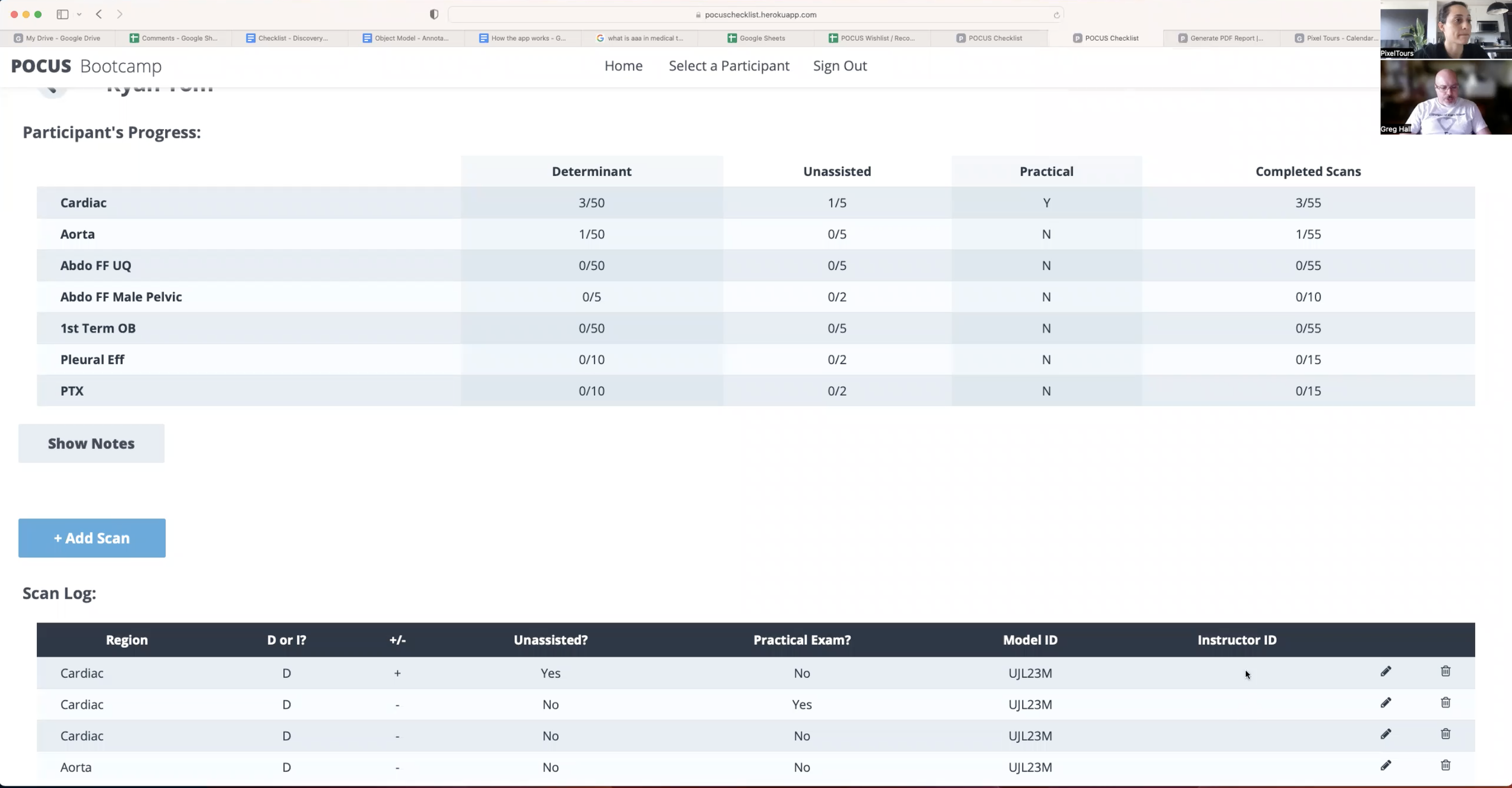
The scan log did not identify which instructor recorded each scan, making it difficult to review individual work or identify recording errors.
Participants had no way to track their progress
Participants could complete assigned scans but had no dedicated view of their progress through the course, limiting their ability to understand what they had completed and what remained.
The opportunity was to address these friction points while working within the existing product architecture and design language.

My Approach
Each recorded scan could now be associated with the instructor who completed it, allowing instructors to isolate their own activity and review their recordings more efficiently.
Giving Participants Visibility Into Their Progress
I introduced a read-only participant experience that allowed users to view their assigned checklist and track their progress without modifying assessment data.
The experience was connected to the existing administration system, allowing administrators to generate and share a unique participant link while maintaining the integrity of the underlying checklist.
Working Within an Existing Product
Because the platform was already established, the goal was not to introduce an entirely new visual system.
I refined the existing interface and interaction patterns so that new functionality felt native to the product rather than layered on top of it. I worked closely with development throughout the process to balance user needs, technical constraints, and the existing system architecture.
I also managed the project across design, development, and QA, coordinating two-week sprints, prioritizing work, and validating the implemented experience.
I worked closely with the client and development team to identify the highest-impact improvements across the existing platform.
Rather than treating the application as a single experience, I designed around the different needs and permissions of each user role, ensuring that changes to one part of the system supported the broader workflow.
Giving Administrators More Control
I introduced a drag-and-drop interaction that allows administrators to customize the order of ultrasound scans for individual courses.
This gave course administrators the flexibility to configure the checklist around the physical layout of their ultrasound stations and the way each course was actually taught.
I also redesigned the course deletion workflow to allow administrators to archive a course and its associated data in a single action, replacing a previously manual process.
Giving Instructors Better Visibility
I improved the scan log by introducing instructor identification and filtering.
The Outcome
The project improved the usability of an established clinical training platform across its core user roles.
Administrators gained greater control over course configuration, instructors gained clearer visibility into their recorded scans, and participants gained a way to understand their progress.
Rather than replacing an established system, the work focused on identifying where the existing product was creating friction and introducing targeted improvements that made the platform more flexible, manageable, and useful for the people relying on it.