Washmen
Consumer Logistics & Operations
Washmen is a Dubai-based consumer logistics and services platform offering on-demand laundry, luxury garment care, and shoe and bag cleaning across three service lines: Washmen, The Finery, and Shoe & Bag Care. Customers use the Washmen app to place orders, manage preferences, track progress, and interact with a multi-service experience shaped by different operational models.
What makes Washmen a unique product to design for is the intersection between the digital experience, the customer's real-world journey, and the operational systems behind the service. My work has focused on connecting these three layers, turning complex operational workflows and offline touchpoints into clear, intuitive customer experiences.
I lead product design for the Washmen customer app end to end, owning the full product lifecycle across all three service lines. My role spans identifying customer and operational problems, understanding how the product works today, defining requirements, designing experiences, and partnering through implementation and release.
The scope of my role has evolved from improving individual customer flows to shaping the broader customer experience and helping build the product itself. As Washmen transitioned core experiences into an AI-assisted development environment, I expanded beyond traditional design delivery, building high-fidelity front-end experiences, defining component logic, and validating working implementations alongside engineering.
The following projects trace the customer journey across Washmen: from placing an order, to creating faster repeat-order experiences, to bringing visibility into the physical operation behind the service, followed by selected feature work.
Laundry Order Flow
Optimizing the Ordering Experience Across Service Selection, Pricing, and Special Instructions
Role: Lead Product Designer
Scope: Problem definition and customer research, UX strategy and information architecture, Ordering flow optimization, Pricing experience design, Instruction workflow design, UI and interaction design, Product specifications, QA validation and iteration
Tools: Figma
Platform: Washmen customer app
Process: Traditional agile, design to engineer handoff
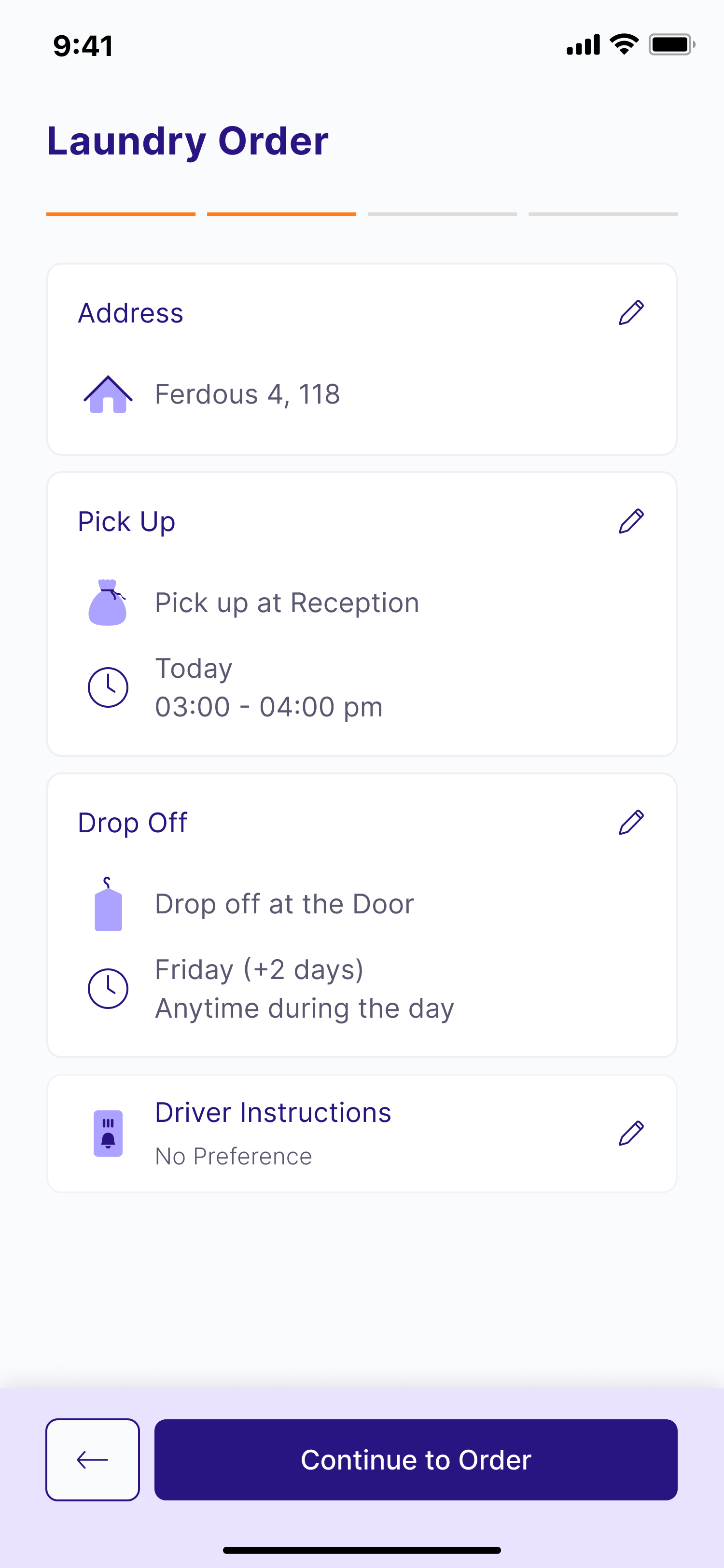
The Laundry Order Flow is the core journey through which customers place an order with Washmen. Rather than redesigning the experience end to end, this project focused on optimizing the highest-friction moments throughout the funnel, from service selection and pricing to billing and garment instructions.
Each improvement was driven by customer research, support feedback, and observed user behavior, with the goal of increasing confidence at the moments where customers were most likely to hesitate or abandon their order.
The Challenge
Research uncovered several independent friction points throughout the ordering journey, all of which contributed to uncertainty during checkout.
Customers weren't confident their service selections would be understood.
Once customers handed over their bags, they had little reassurance that the facility would know exactly which services they expected to be performed. There was no clear moment where they could review or confirm their selections before placing an order.
Pricing was disconnected from the ordering journey.
Customers often wanted to understand pricing before committing to an order, but pricing existed as a standalone experience outside the checkout flow. Exploring prices interrupted the ordering journey and created unnecessary backtracking.
Compounding this, Washmen operates on assessment-based pricing. Final charges are only confirmed after garments are inspected at the facility, making it even more important to clearly distinguish estimated costs from final billing.
The instruction system couldn't capture real customer requests.
The ordering flow relied on a fixed set of predefined preferences. While these covered common scenarios, they didn't accommodate the more specific requests customers frequently have for individual garments.
As a result, customers had no reliable way to communicate instructions beyond the available options, reducing confidence that their items would be handled exactly as intended.
My Approach
Rather than treating the ordering flow as a single problem, I optimized each stage independently while ensuring the experience remained cohesive from beginning to end.
Increasing Confidence Through Service Selection
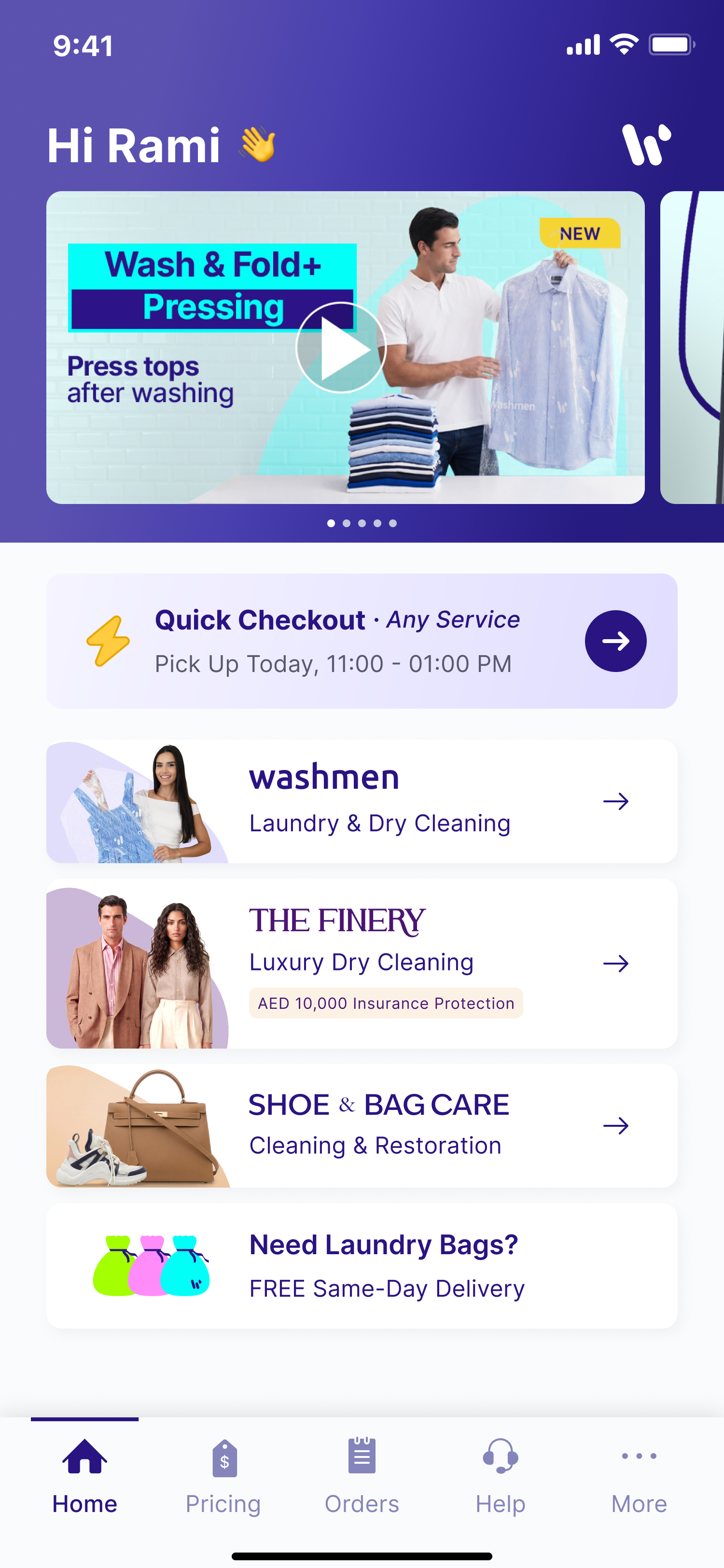
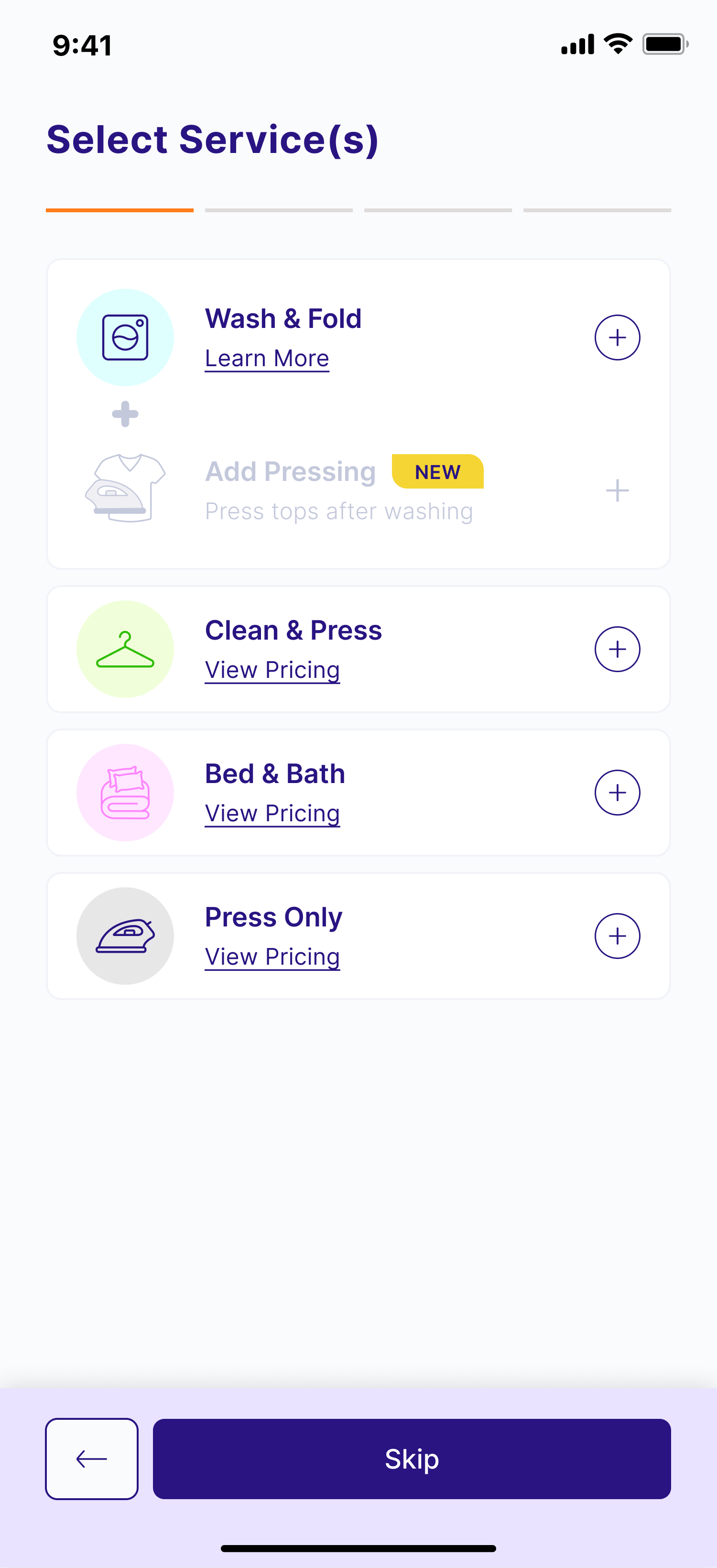
I introduced a dedicated service confirmation step that allows customers to clearly review and confirm the services included in their order before continuing.
This small change reinforced that the facility would receive the correct service information and reduced uncertainty before checkout.
Bringing Pricing Into the Funnel
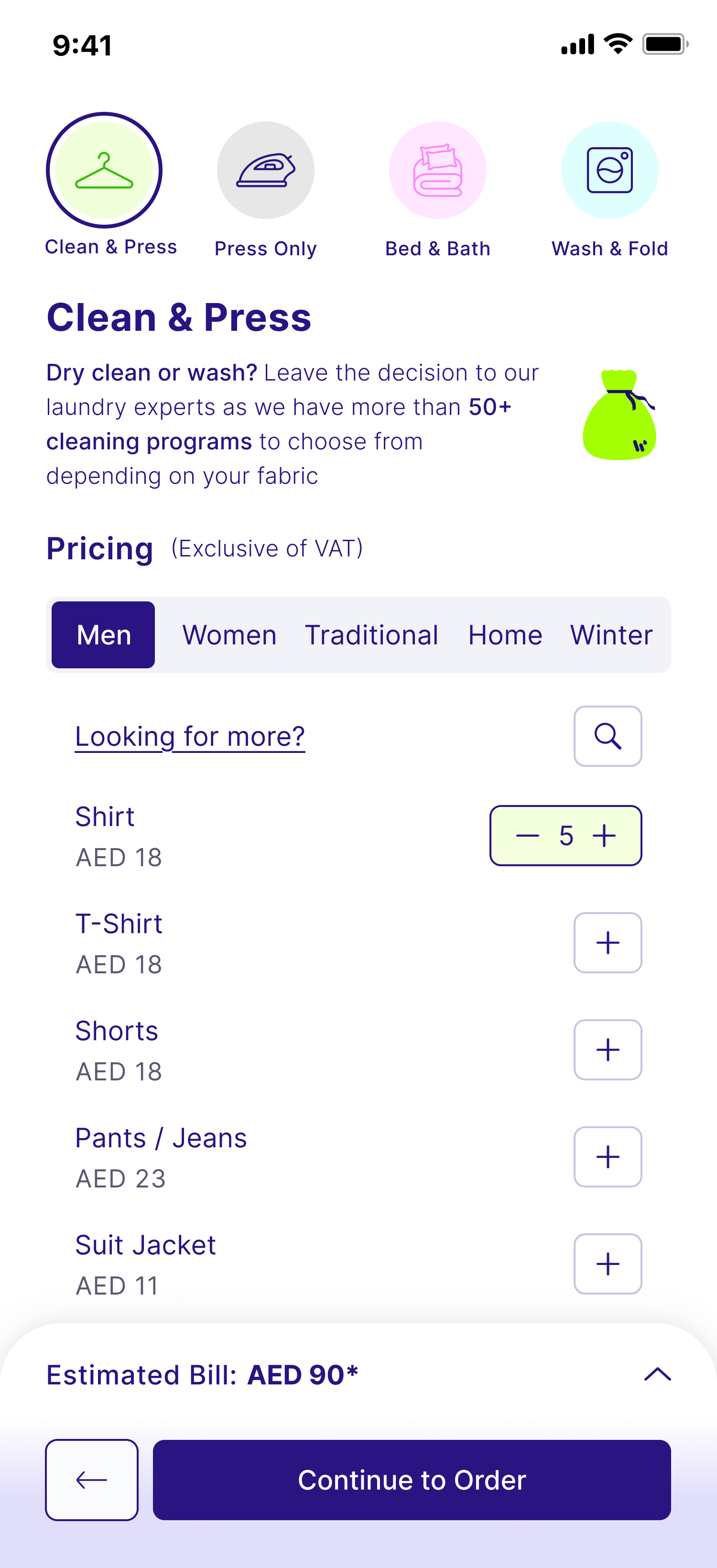
Instead of treating pricing as a separate destination, I integrated it directly into the ordering journey.
Customers can now access pricing in two ways:
- directly from the homepage as an entry point into ordering; and
- from within the order flow itself through View Pricing, allowing them to explore services without leaving checkout.
This transformed pricing from a dead-end information page into a seamless part of the purchasing experience.
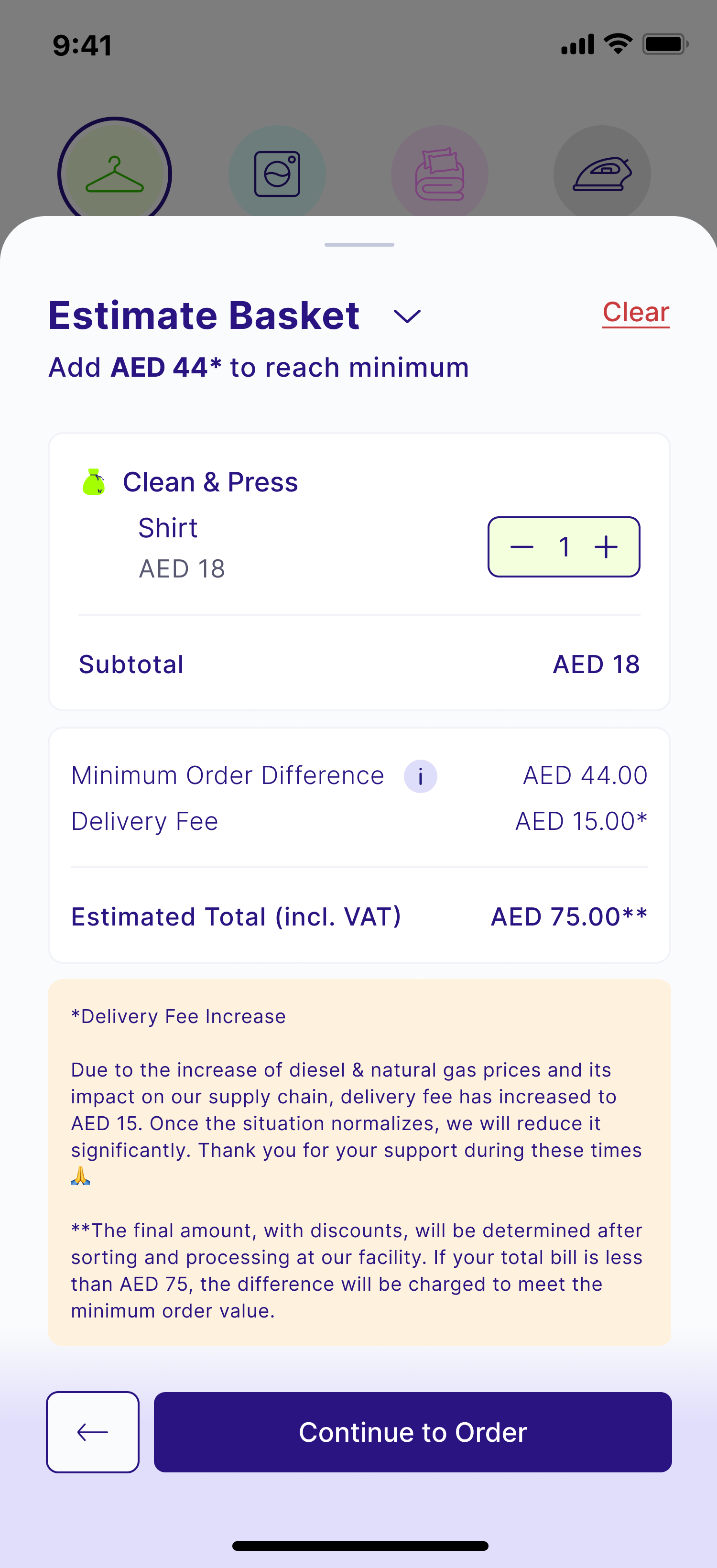
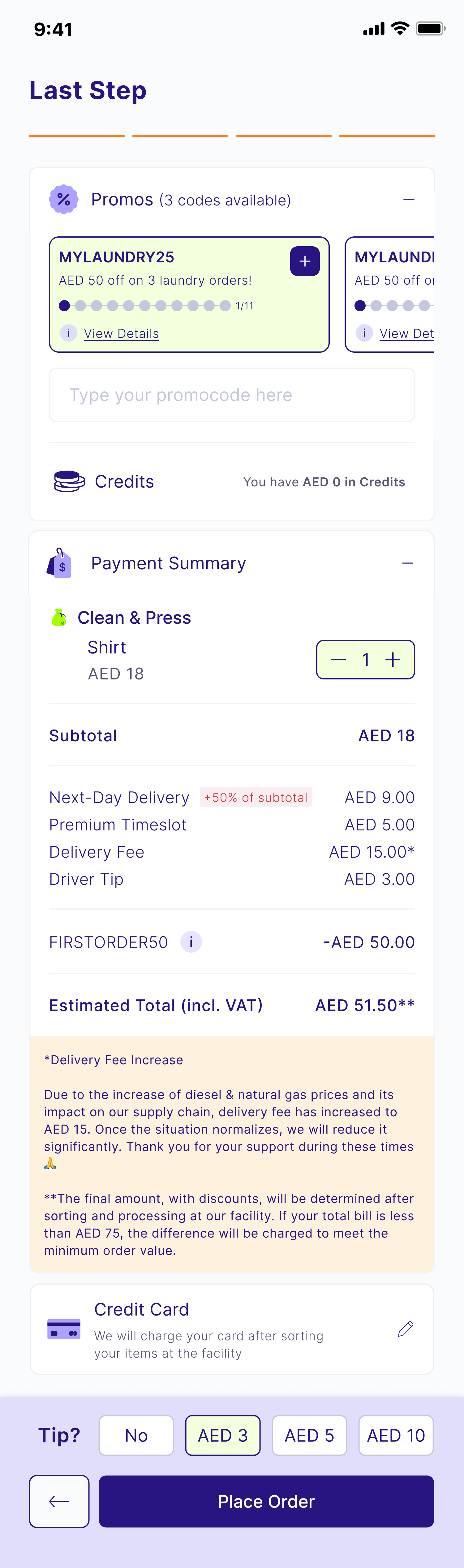
I also redesigned the payment summary to better communicate estimated pricing.
When customers use the basket estimator, the estimated total now carries through into checkout with clear messaging that it is an estimate rather than the final charge. If no estimate exists, the summary automatically adapts, ensuring the billing experience remains accurate and understandable in both scenarios.
Making Instructions More Flexible
The existing preference system was too rigid to support real customer behavior.
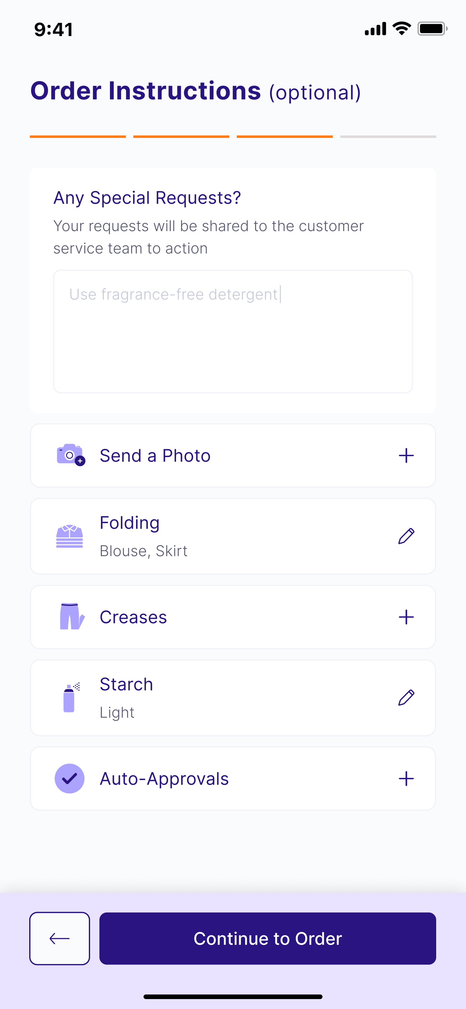
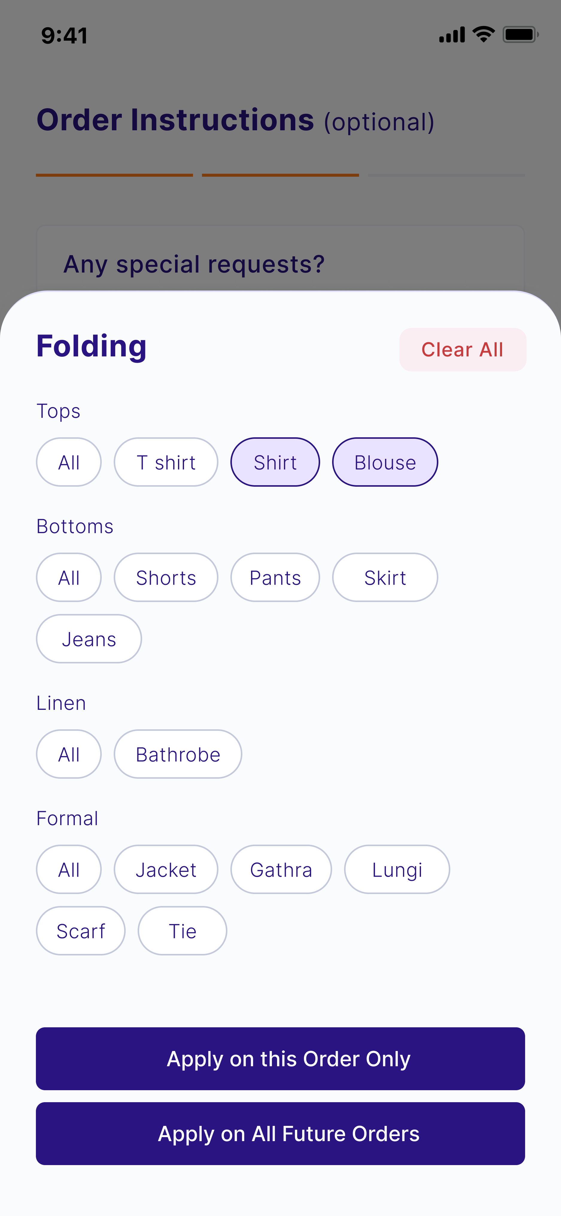
To address this, I introduced a flexible special instructions experience alongside the existing preferences.
Customers can now provide garment-specific requests, such as asking for a particular shirt to be folded a certain way or highlighting special handling requirements, while still benefiting from structured preferences for common scenarios.
Beyond the customer experience, I also defined how these instructions should flow through the operational system, ensuring they are routed to the appropriate Customer Experiences teams and facility stations where they can be reviewed and actioned by the relevant teams.
The Outcome
The result was a more confident and transparent ordering experience.
Customers can now:
- clearly confirm the services included in their order;
- understand pricing without leaving the checkout journey;
- distinguish estimated costs from final billing;
- provide garment-specific instructions beyond predefined preferences;
- trust that their requests will reach the appropriate operational teams
Rather than solving one large problem, this project addressed multiple friction points throughout the ordering funnel. Together, these improvements created a smoother, more intuitive checkout experience while increasing customer confidence in a service where the final price is determined after facility assessment.
Quick Checkout
Bridging the Gap Between Online Ordering and Offline Customer Behavior
Role: Lead Product Designer
Scope:Problem definition and opportunity framing, Customer behavior research, UX strategy and information architecture, Cross-service flow design, UI and interaction design, Product specifications, QA validation and iteration
Tools: Figma
Platform: Washmen customer app
Process: Traditional agile, design to engineer handoff
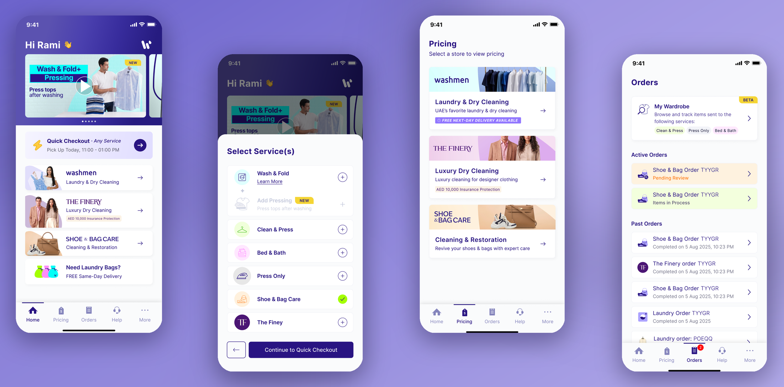
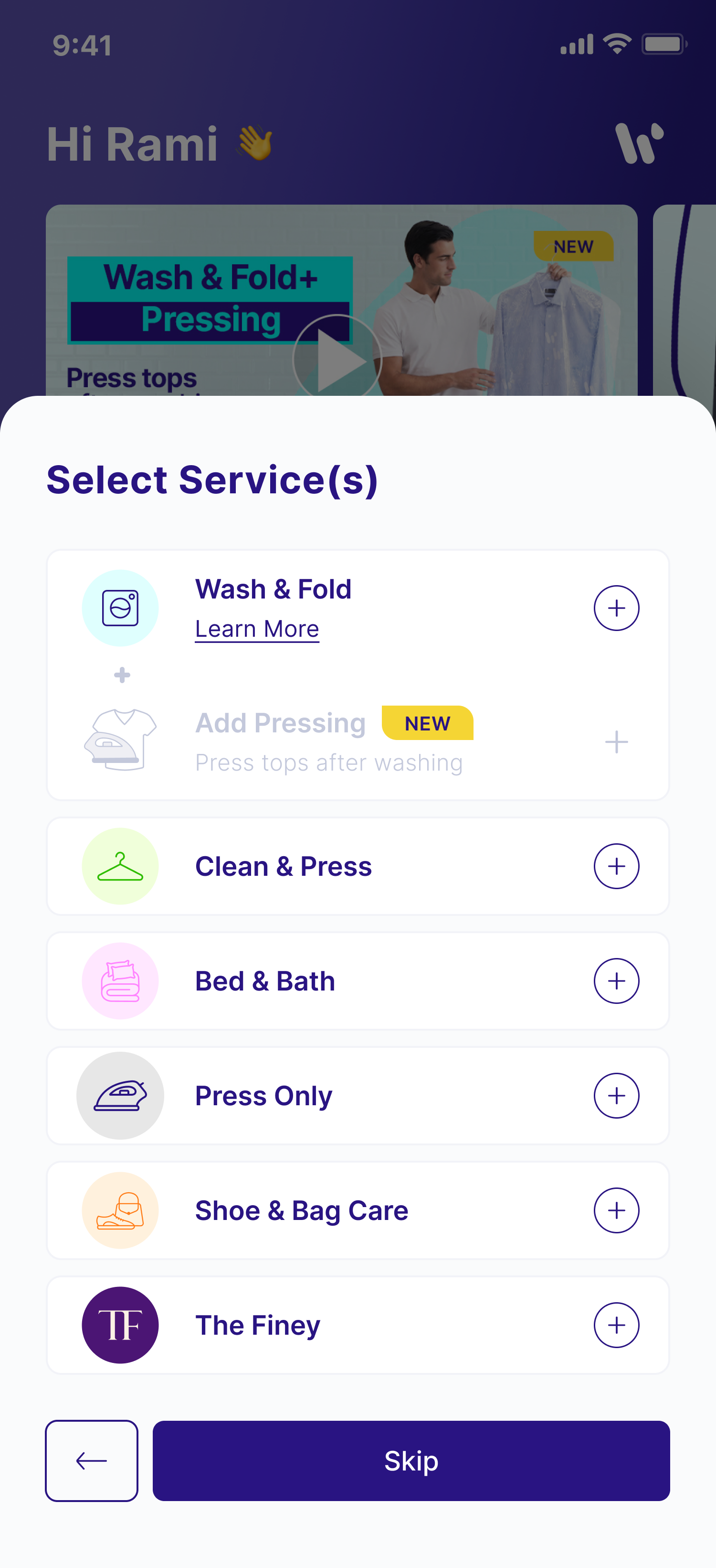
Quick Checkout is a streamlined ordering experience designed for returning customers, allowing them to place orders across Laundry, Shoe Care, and The Finery in just a few taps.
The project challenged a fundamental assumption behind traditional checkout flows: that customers begin the ordering journey inside the app. In reality, repeat customers have already made most of the important decisions before they ever open Washmen. Their items are already sorted into service-specific bags, their preferences are established, and the logistical details of their orders are largely set.
The goal of Quick Checkout was to transform a fragmented, multi-step ordering experience into a single, cross-service flow without disrupting the storefront model the business relied on.
The Challenge
Washmen operates as three distinct storefronts, Laundry, Shoe Care, and The Finery, each with its own requirements, preferences, and operational logic.
While this separation made sense from a business perspective, it created significant friction for repeat customers.
A customer wanting to place an order across multiple service lines wasn't placing three separate orders in their mind; they were simply sending items to Washmen. Yet the product required them to complete three independent checkout journeys from start to finish.
At the same time, there was an important business constraint: the storefront model had to remain intact. Leadership wanted each service line to keep its own entry point and identity, as every service has unique requirements and operational rules.
The challenge, therefore, wasn't to redesign the storefront architecture, it was to remove the friction created by it.
My Approach
Designing Around Real Customer Behavior
Rather than starting with the app, I started by understanding how customers behave offline.
By the time returning customers open Washmen:
- they already have their service-specific bags ready;
- those bags already determine the service type;
- their address rarely changes;
- their preferences are already saved;
- and pickup and drop-off are largely determined by the order date and service selected
The existing checkout flow ignored this context and asked customers to repeatedly provide information the system already knew.
The opportunity was not to collect less information, it was to stop asking for information customers had effectively given us in advance.
Building a Layer Above the Storefront Model
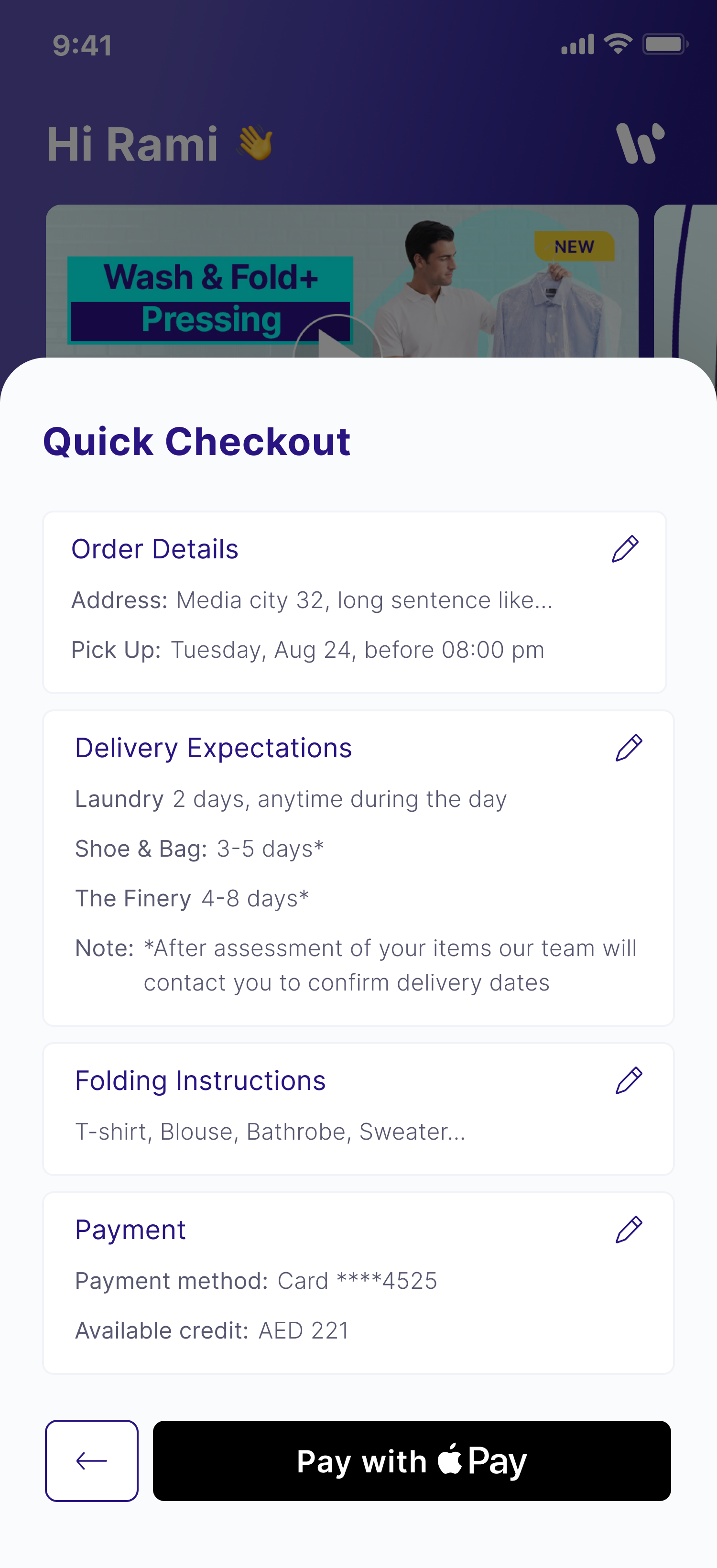
Instead of replacing the existing storefront structure, I designed Quick Checkout as a lightweight layer on top of it.
The experience reduces ordering to a few confirmations:
- service selection is surfaced but optional, since the customer's bags already indicate the service;
- pickup defaults to the next available time slot, for example, if it's 5:00 PM, the customer immediately sees a 5:00–6:00 PM pickup window;
- drop-off is automatically calculated based on the selected service line; and
- the customer simply reviews and confirms the order.
What previously required customers to navigate three separate checkout flows became a single cross-service experience completed in just a few taps.
The design preserved the business' storefront model while removing the friction customers experienced when ordering across multiple services.
The Outcome
Quick Checkout transformed a fragmented ordering process into a single, streamlined experience for repeat customers.
Customers can now place orders across multiple service lines without repeatedly entering the same information or navigating separate checkout journeys.
More importantly, the solution respected both sides of the problem:
- the customer's mental model of "I'm placing one order"; and
- the business's need to maintain separate storefronts for each service.
Rather than forcing customers through unnecessary steps, the experience adapts to behaviors that already exist offline, reducing friction and making reordering feel effortless.
Order Tracking
Bringing Facility-Level Transparency to the Customer Experience
Role: Lead Product Designer (end-to-end ownership)
Scope:Stakeholder discovery and requirements gathering, Reverse-engineering legacy business logic, Product specification and PRD authoring, UX strategy and information architecture, State mapping and component definition, UI and interaction design, Motion design and prototyping, Front-end implementation in Lovable, AI migration planning and engineering handoff, QA validation and iteration, Design system ownership
Tools: Figma, Lovable
Platform: Washmen customer app
Process: Research, design, build to engineer integration
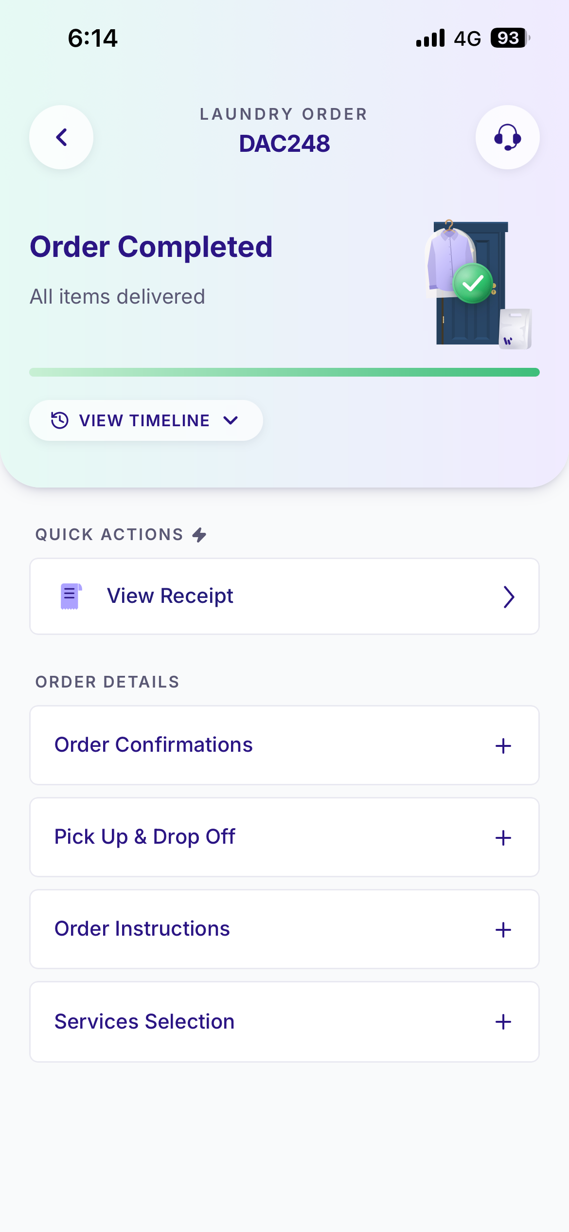
Order Tracking is Washmen's post-purchase experience, enabling customers to follow their order from pickup to drop-off across Laundry, Shoe & Bag Care, and The Finery.
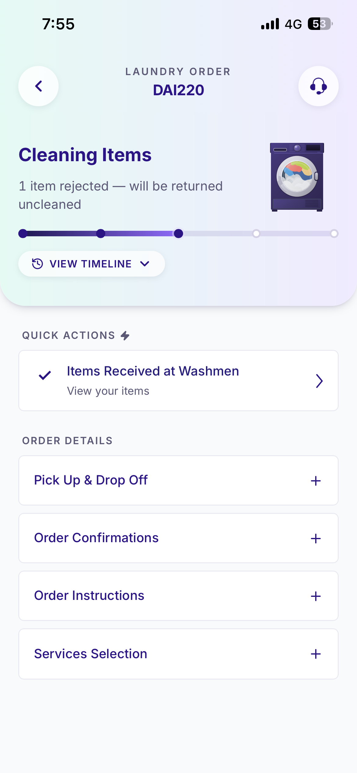
Unlike traditional tracking experiences that rely on a generic "In Progress" status, this system provides customers with end-to-end visibility into what is happening to their items throughout their journey, including inside the facility and down to the individual garment.
This project was undertaken as part of Washmen's migration to an AI-assisted development environment. While order tracking already existed as a legacy experience, there was no documentation explaining how the system actually worked. My role was to reverse-engineer the existing logic, redesign the experience, rebuild the front end in Lovable, and establish the foundation for engineering to reconnect the product to the backend and ship it into production.
The Challenge
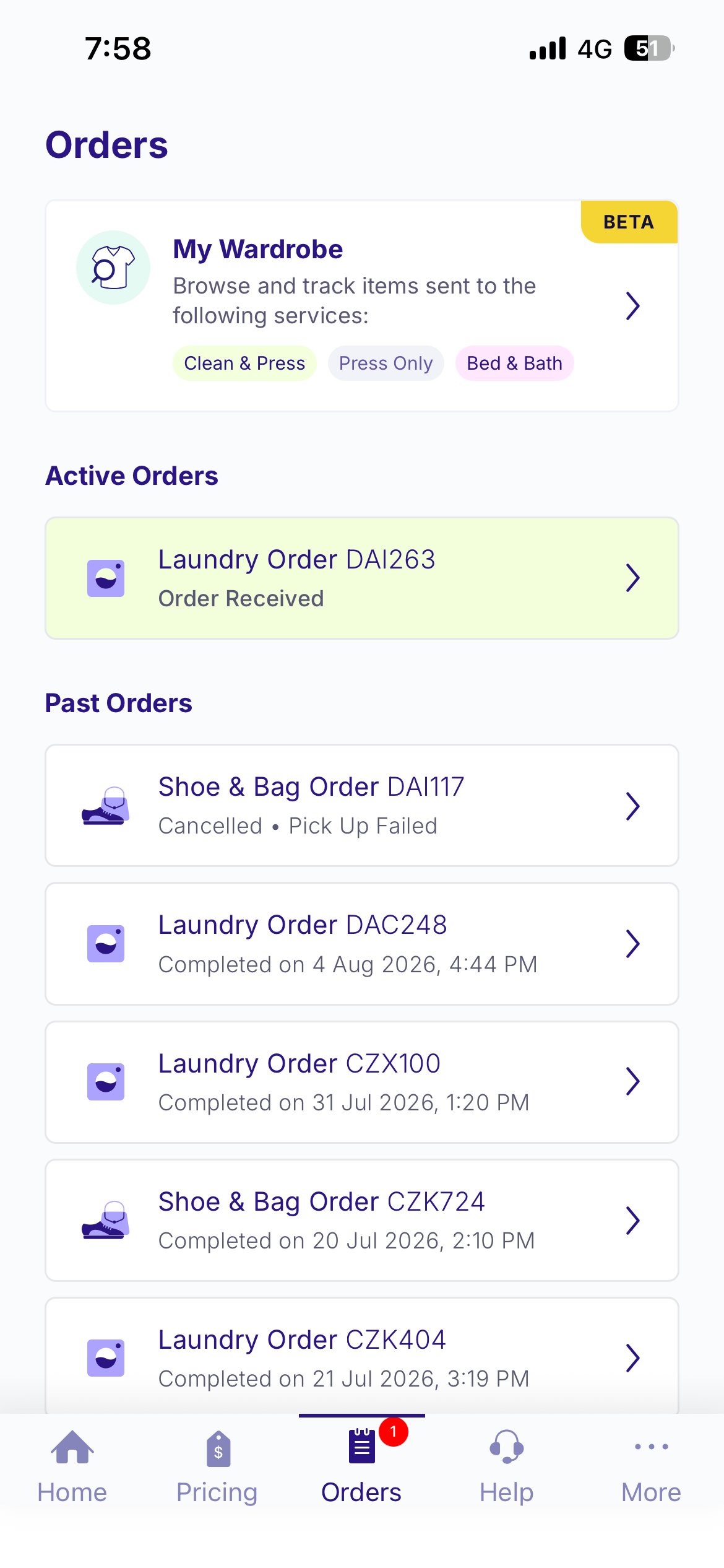
The existing tracking experience had evolved over time without a single source of truth.
There was no documentation outlining:
- what are all the different statuses;
- how orders moved between statuses;
- which components should appear at each stage;
- what actions customers could take;
- how exceptions should be handled; or
- how the experience differed across service lines.
Before improving the experience, the first challenge was simply understanding it
Once an order entered the facility, visibility largely disappeared. Customers had little understanding of where their items were, whether anything required their attention, or when they could expect their order to return. This uncertainty frequently resulted in support requests asking basic questions such as:
"Where are my items?"
"Has cleaning started?"
"When will I receive my order back?"
The system also needed to accommodate a wide range of operational scenarios:
- standard order progression;
- customer approval flows;
- failed pickups and drop-offs;
- delays and exceptions;
- partially completed orders; and
- service-specific workflows across multiple business lines.
Each scenario required a different level of visibility, interaction, and tone.
My Approach
Reconstructing the System
Because the tracking logic existed only in the backend, the first phase of the project was discovery.
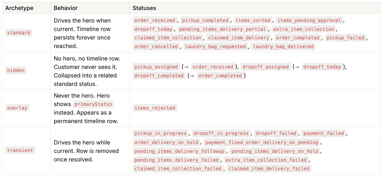
I partnered closely with engineers and operational stakeholders to reverse-engineer the system, mapping:
- every order status;
- the conditions that triggered state transitions;
- the data powering each state;
- the components associated with each status; and
- the customer actions available at each step.
This investigation became the foundation for the entire product and established the first source of truth for how tracking worked across Washmen.
Designing for Clarity and Confidence
The guiding principle behind the redesign was simple:
At any point in the order lifecycle, customers should immediately understand:
- where their order is;
- whether they need to do anything; and
- what happens next.
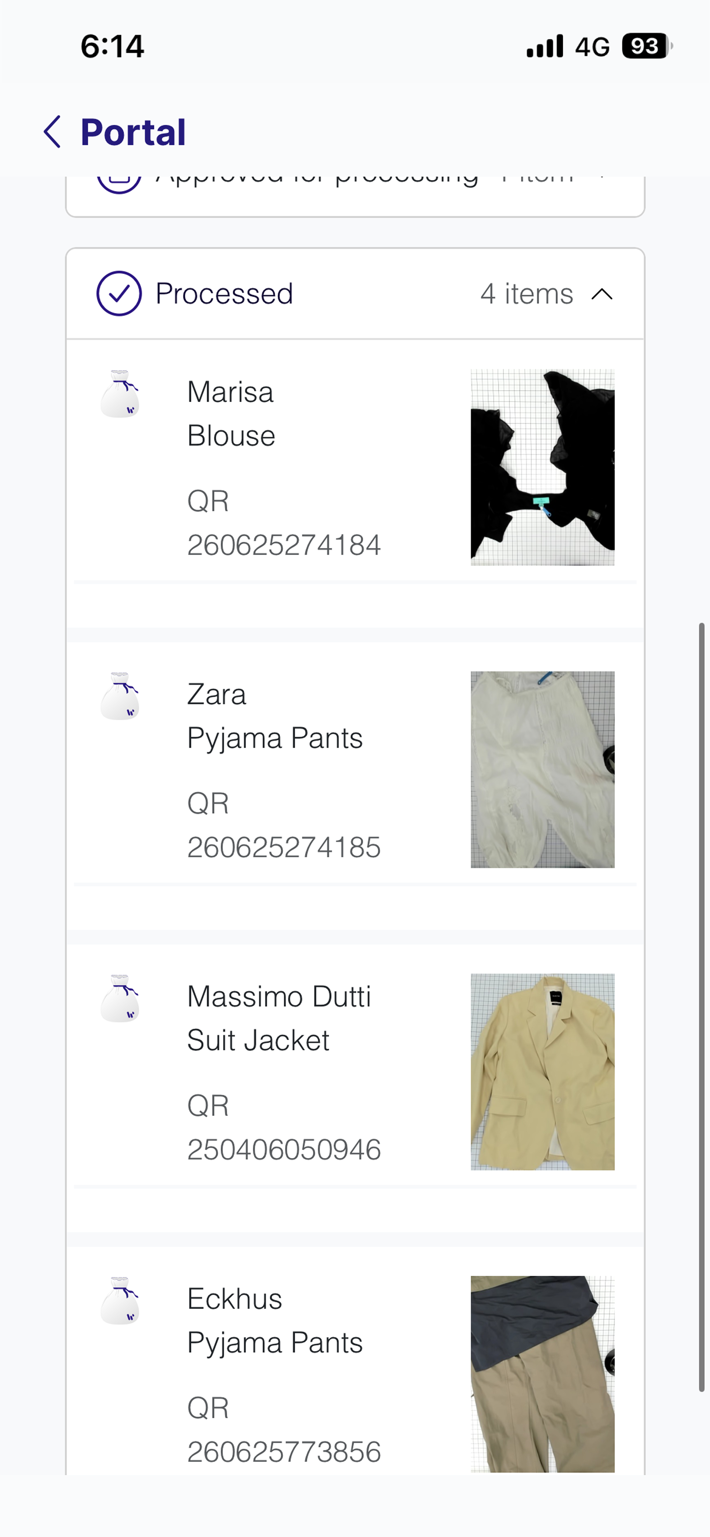
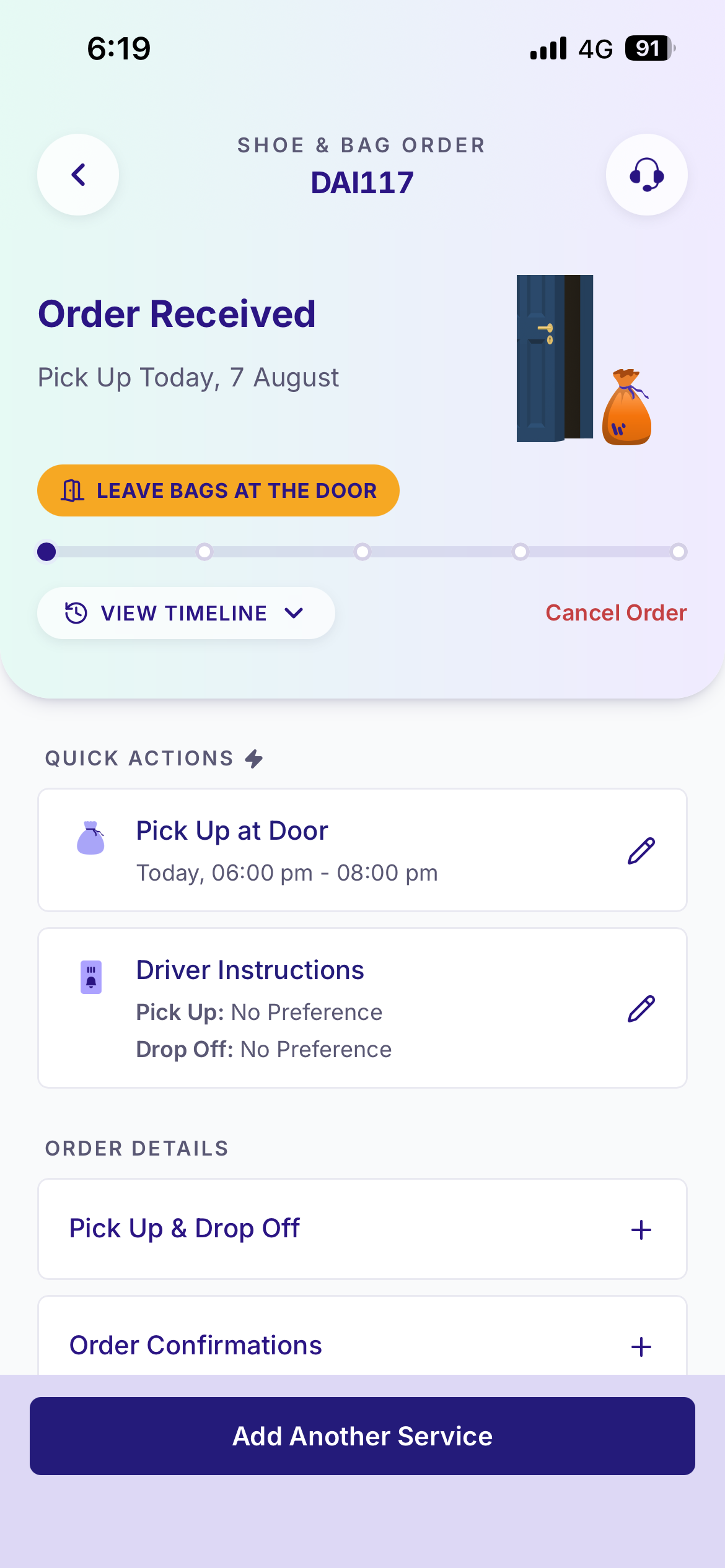
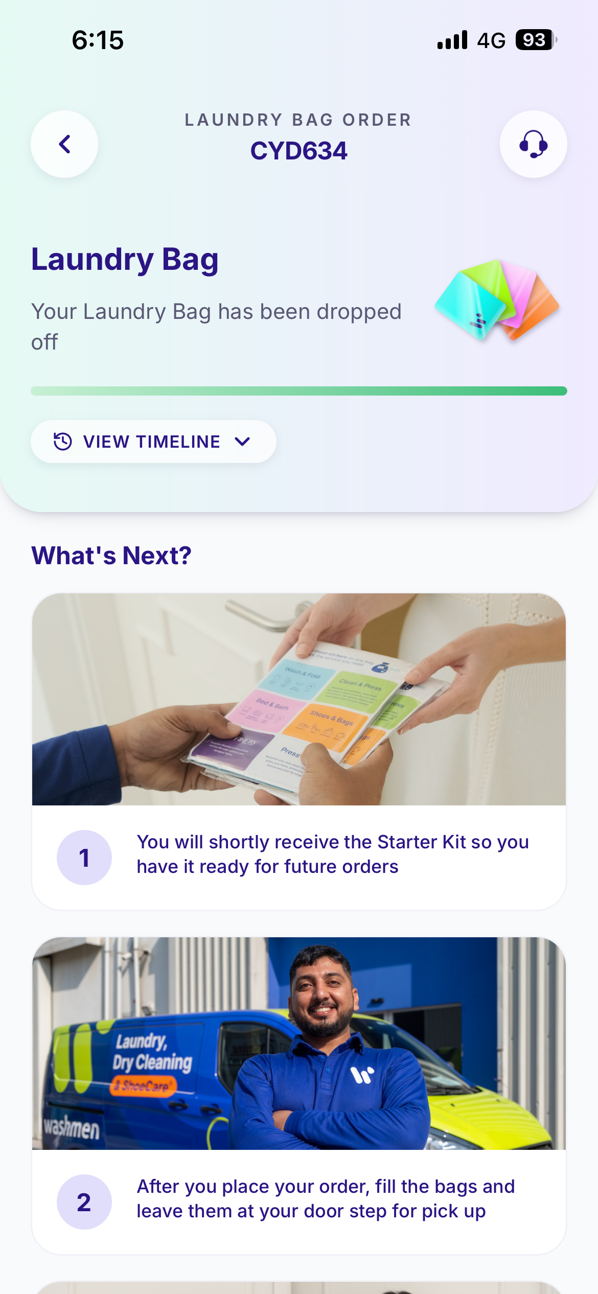
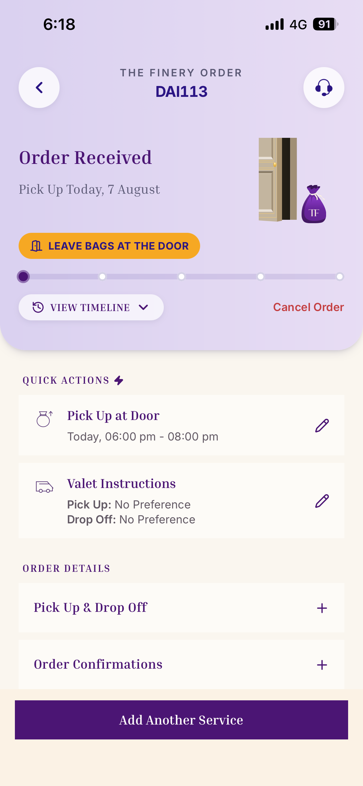
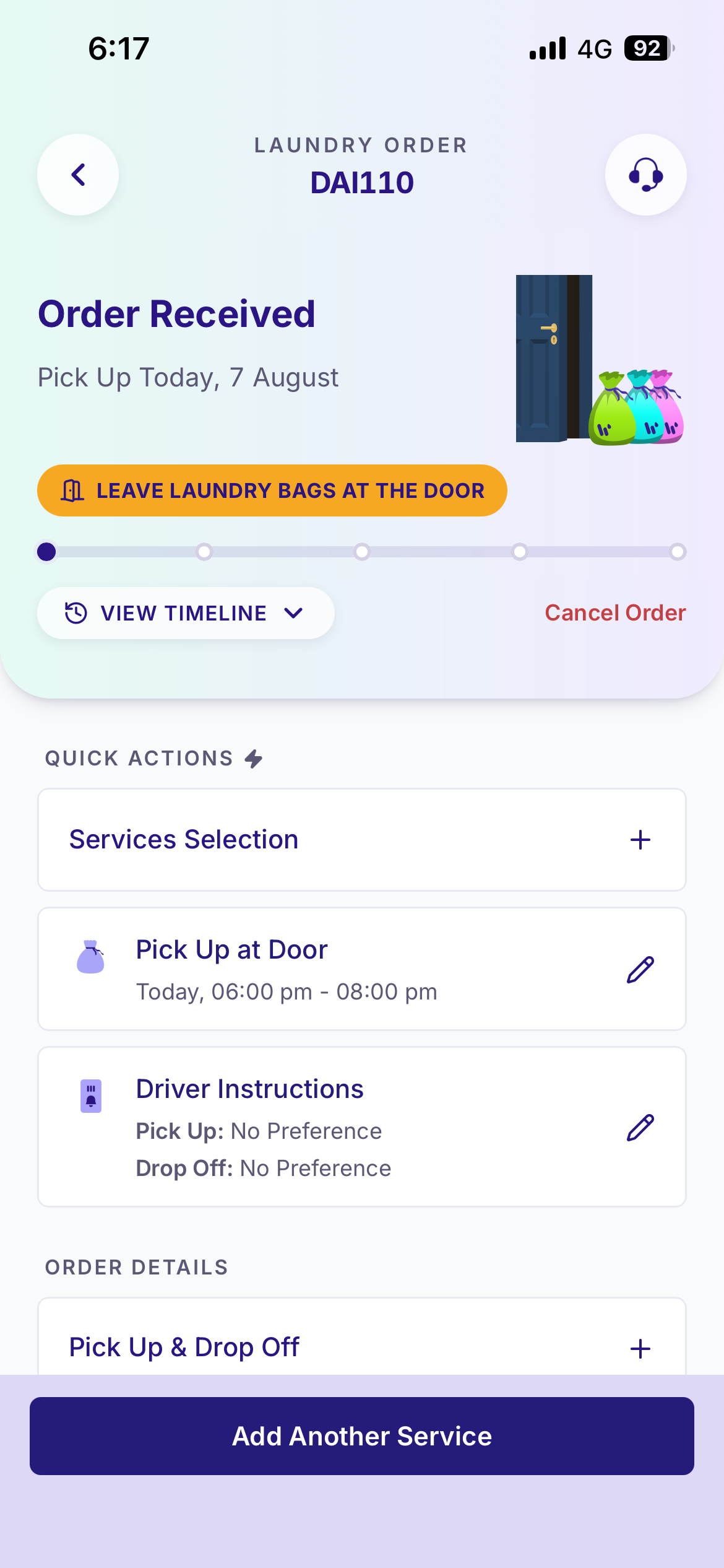
Tracking is fundamentally a dynamic system. The interface changes based on live backend data, with components appearing conditionally depending on the order's status.
For example:
- View Receipt only appears once billing confirms that a receipt exists.
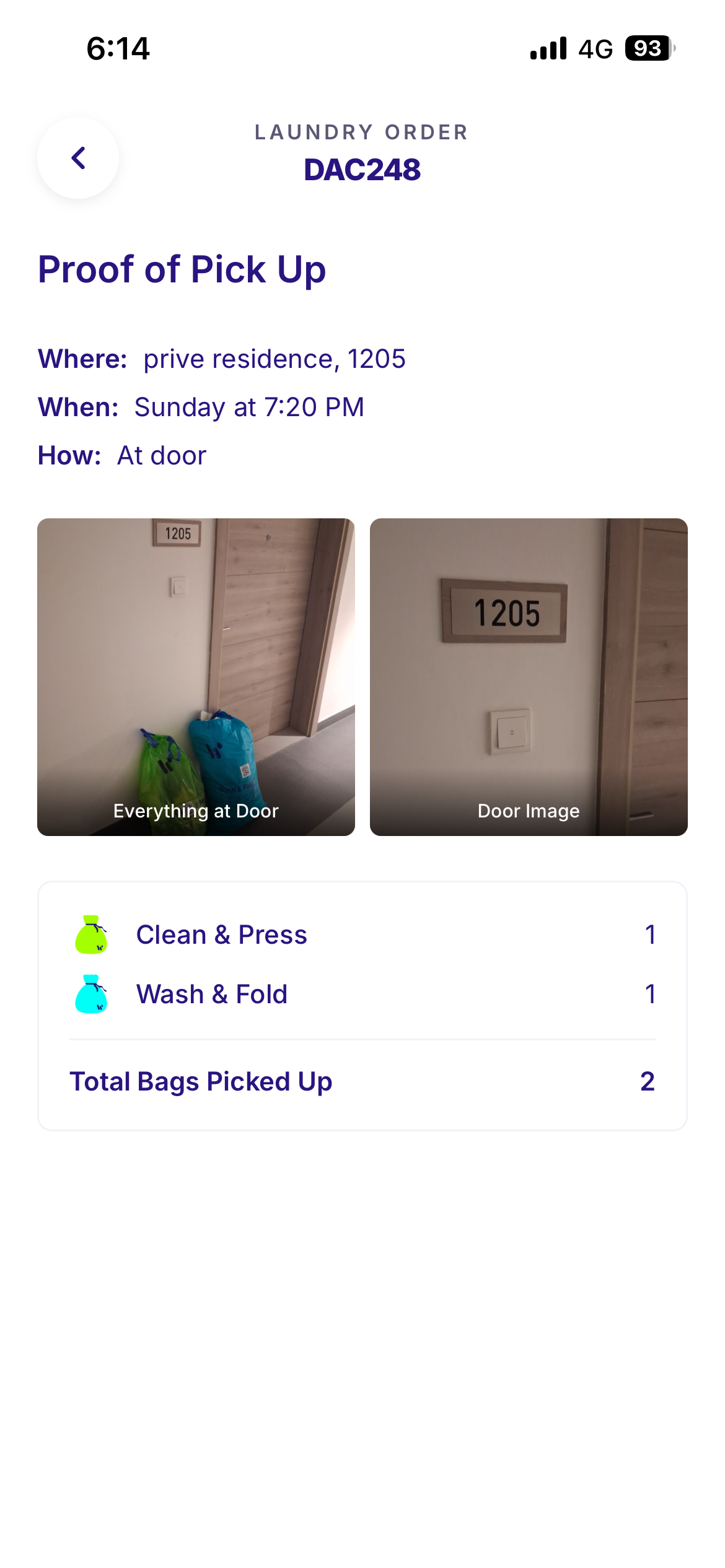
- Proof of Pickup and Proof of Drop-off surface evidence captured by drivers.
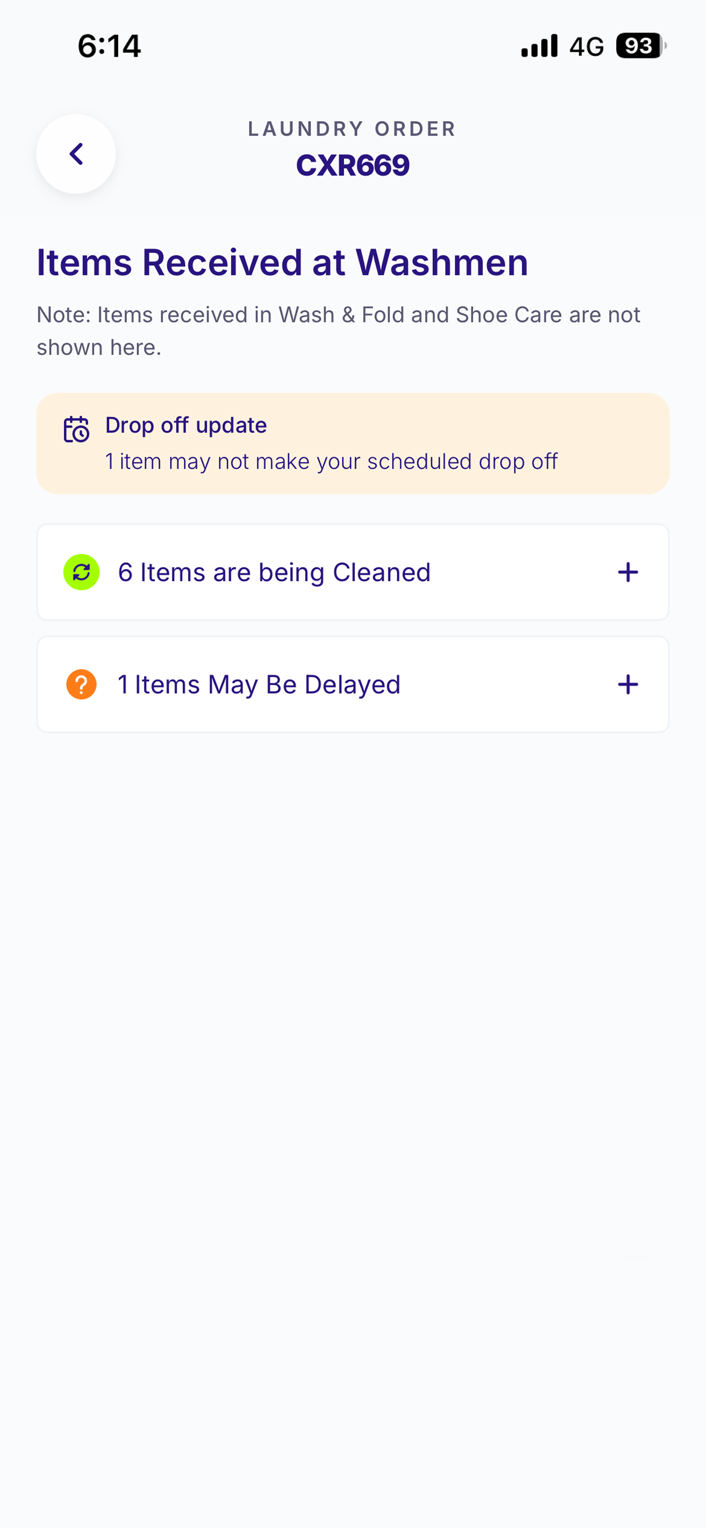
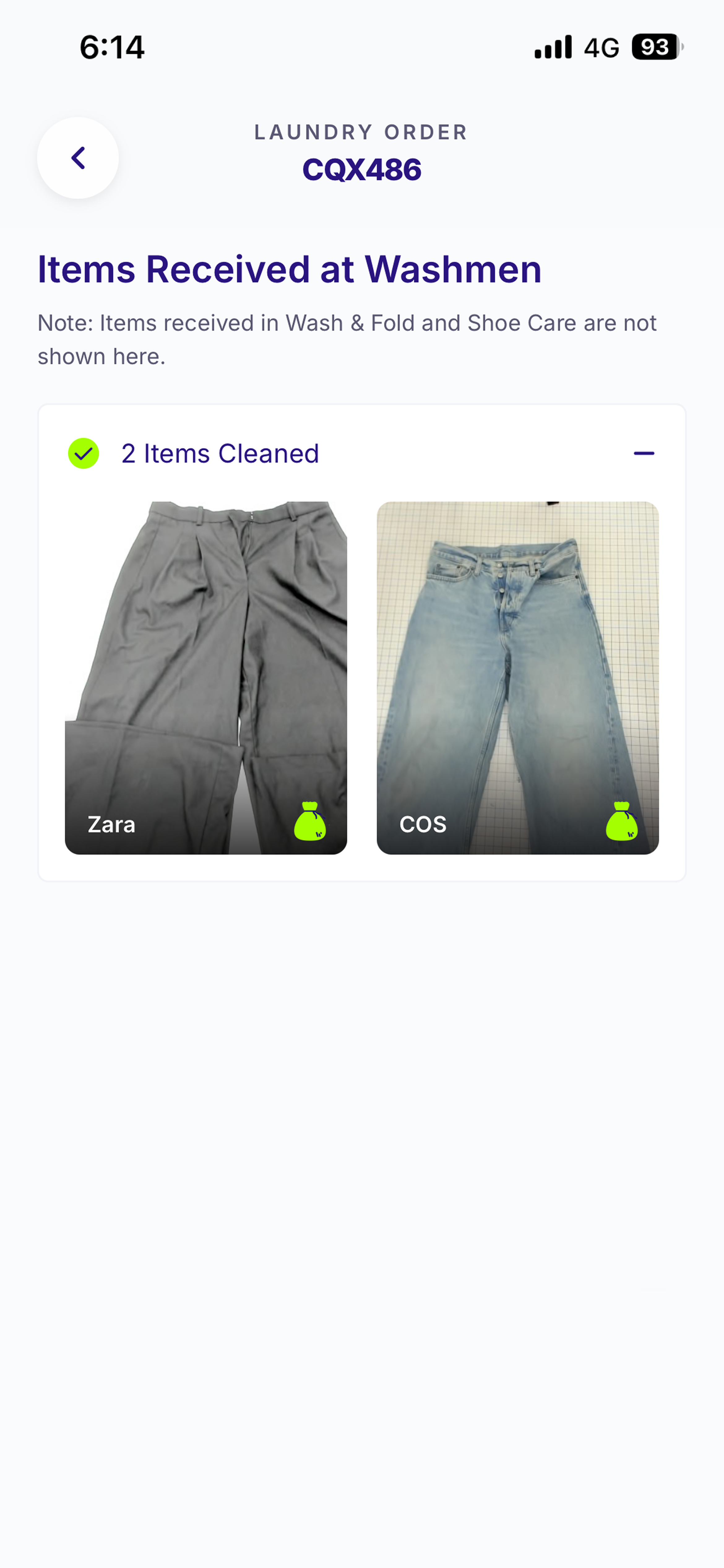
- Items Received at Washmen opens a detailed garment-level breakdown.
- Before & After surfaces restoration results.
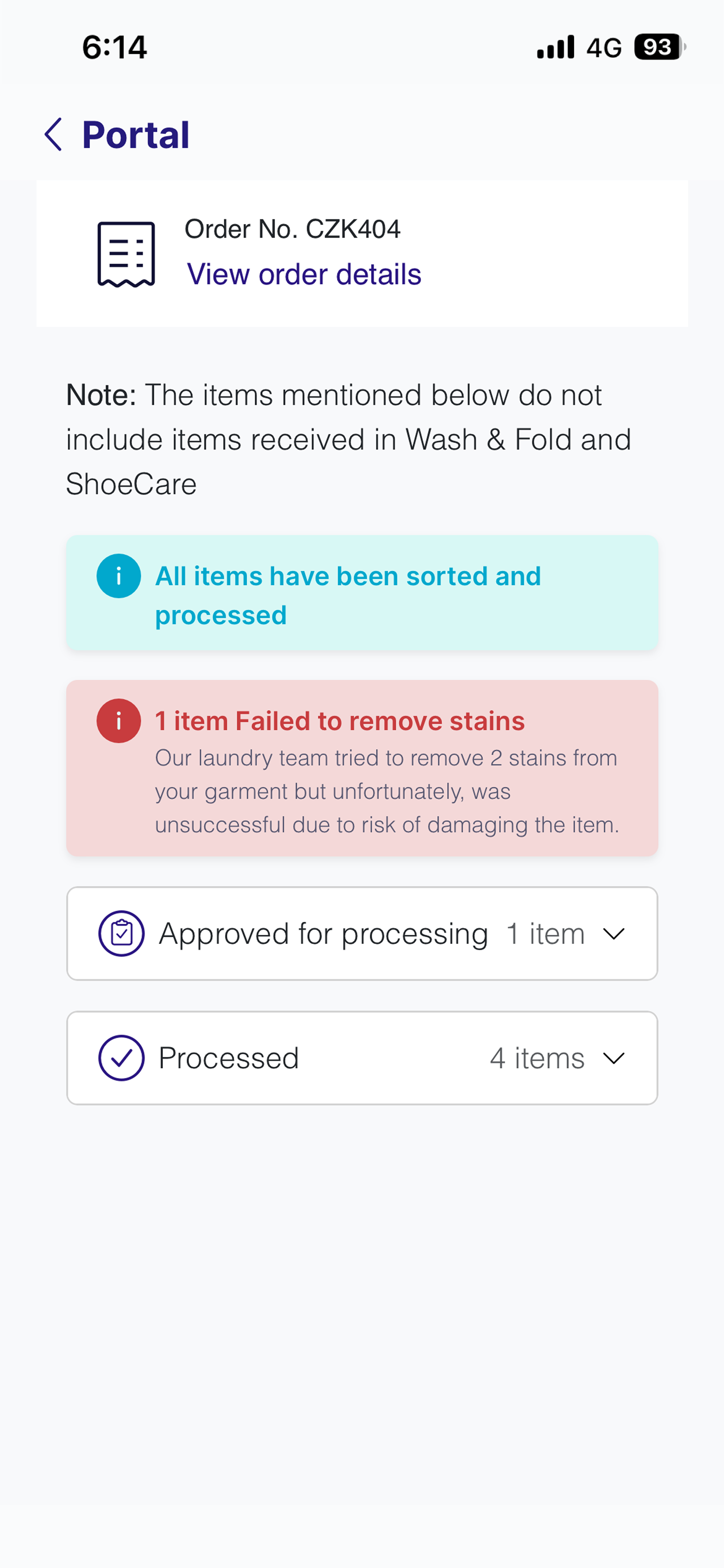
- Approval banners appear only when customer action is required.
Each interaction leads to either a dedicated screen or a contextual bottom sheet, depending on the complexity of the action.
The core design challenge was determining which components belonged to which status, under what conditions they should appear, and how customers should move between them.
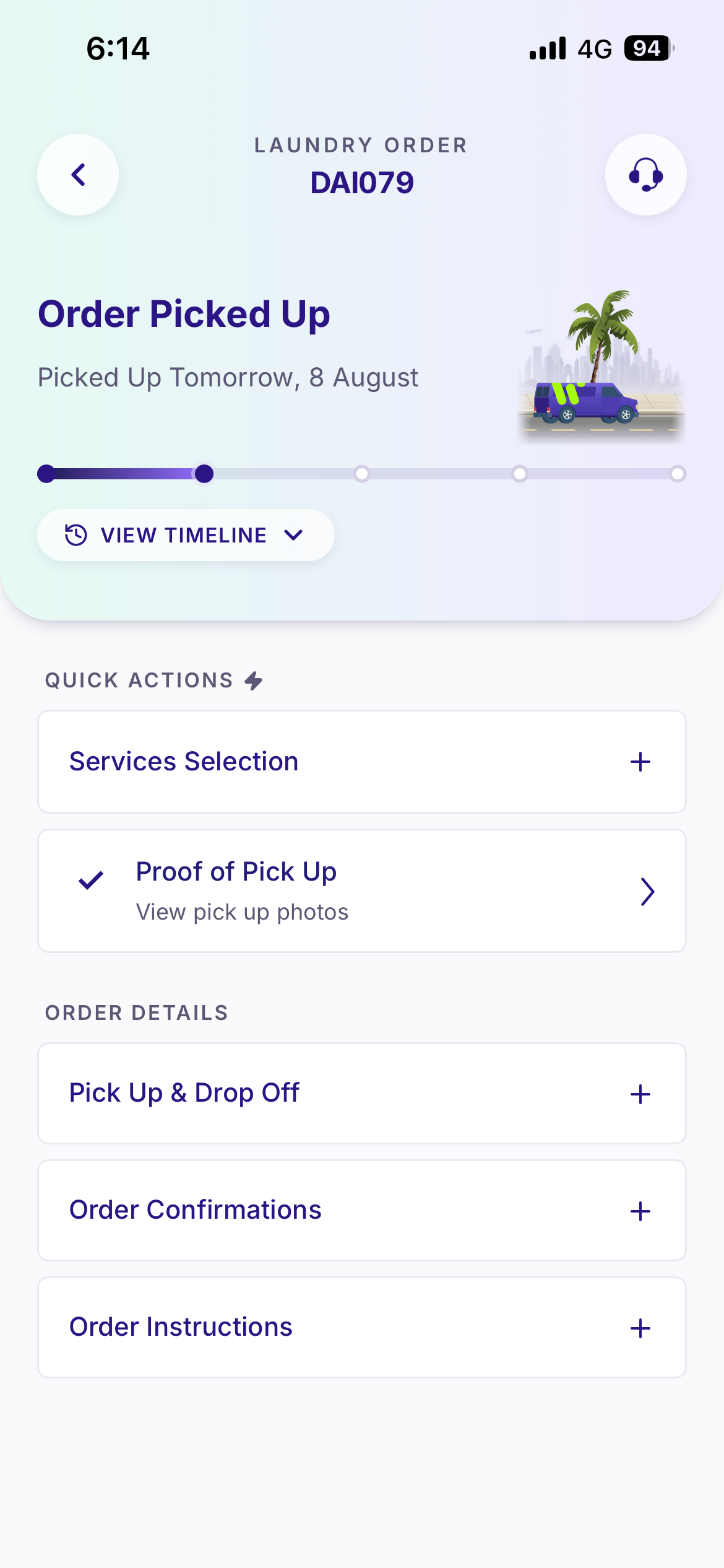
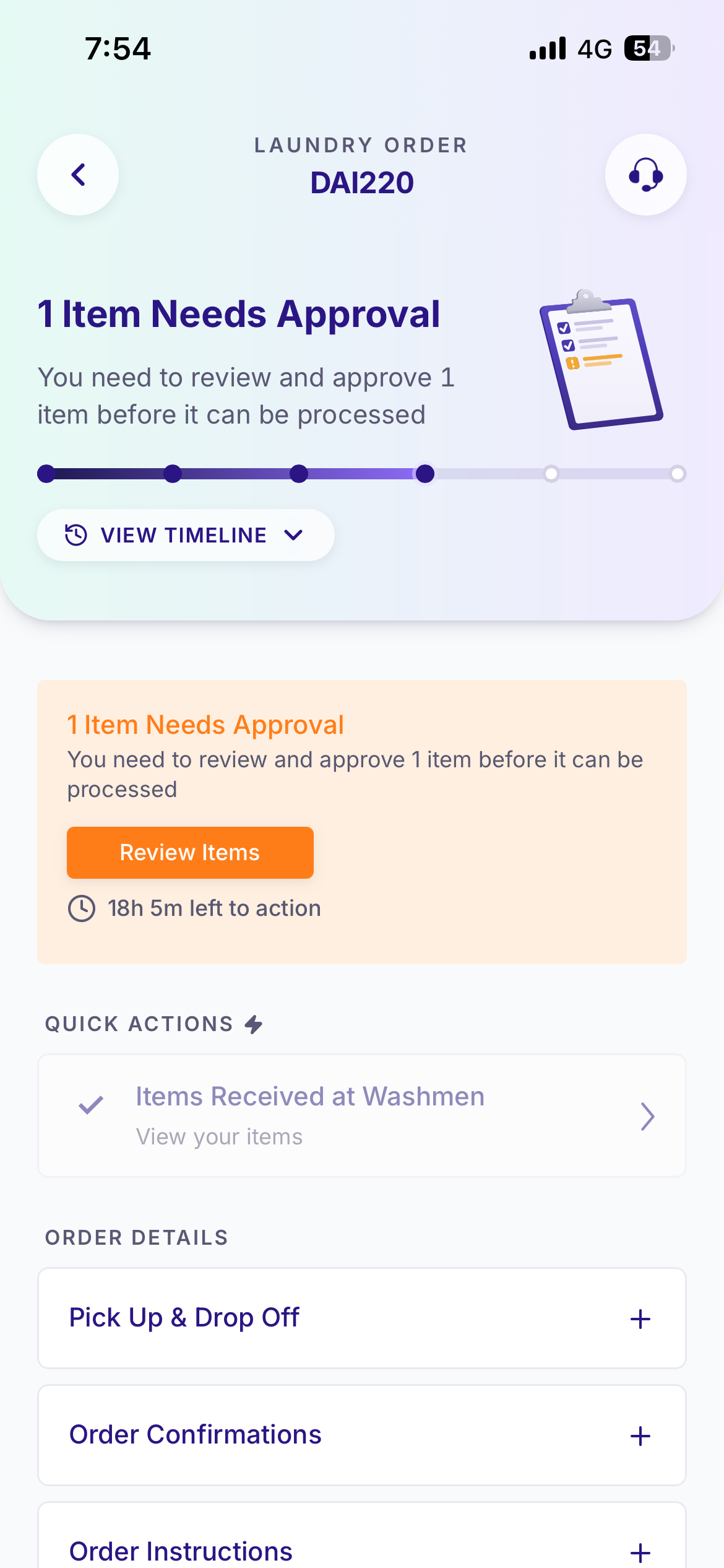
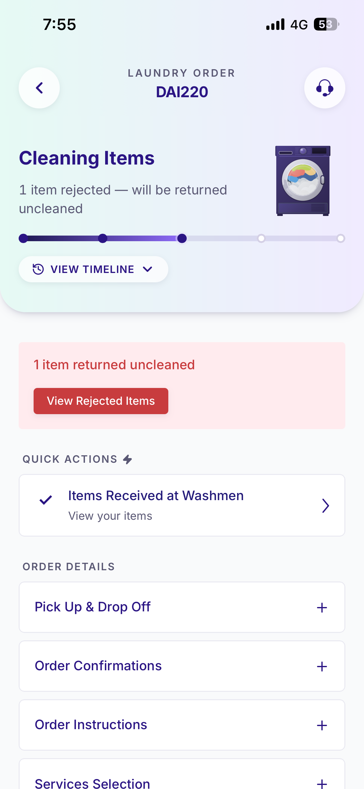
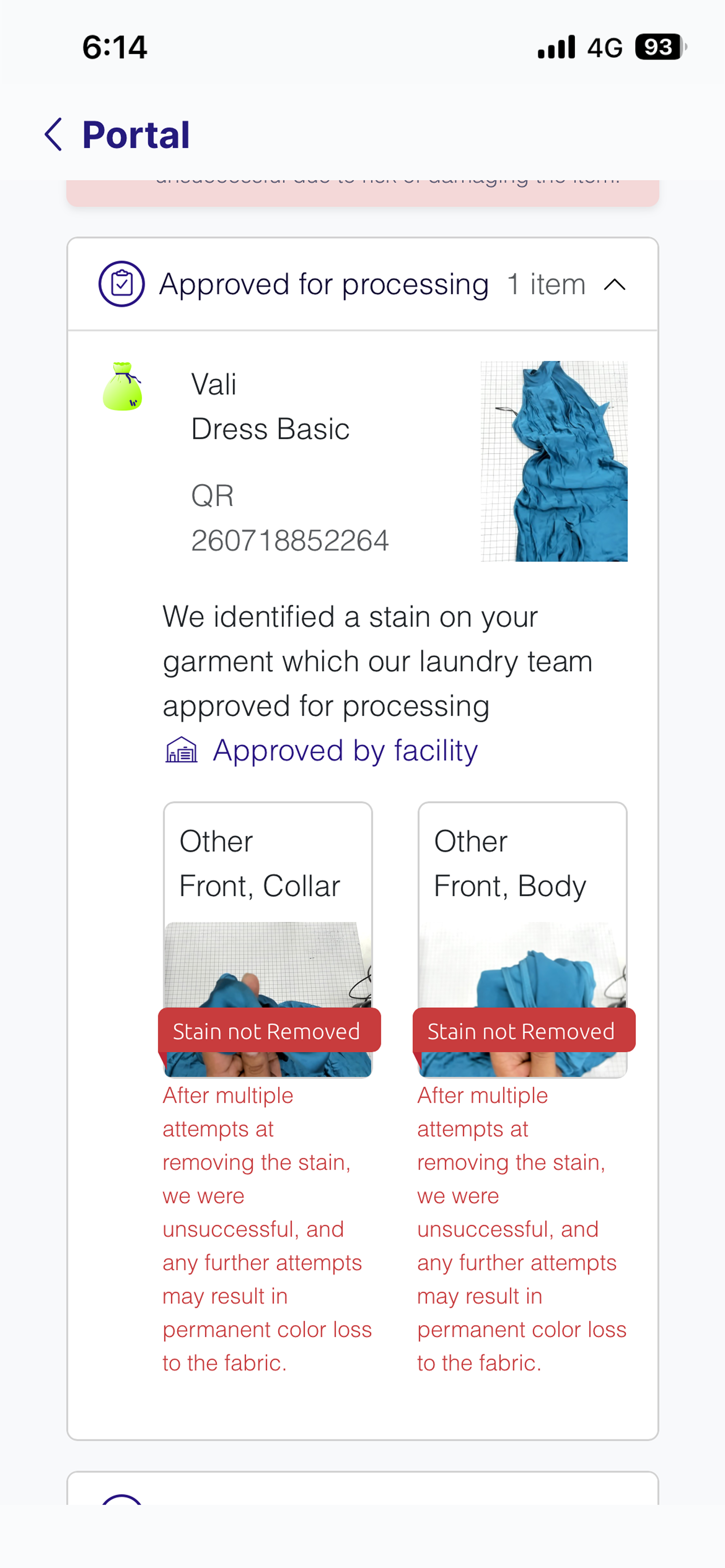
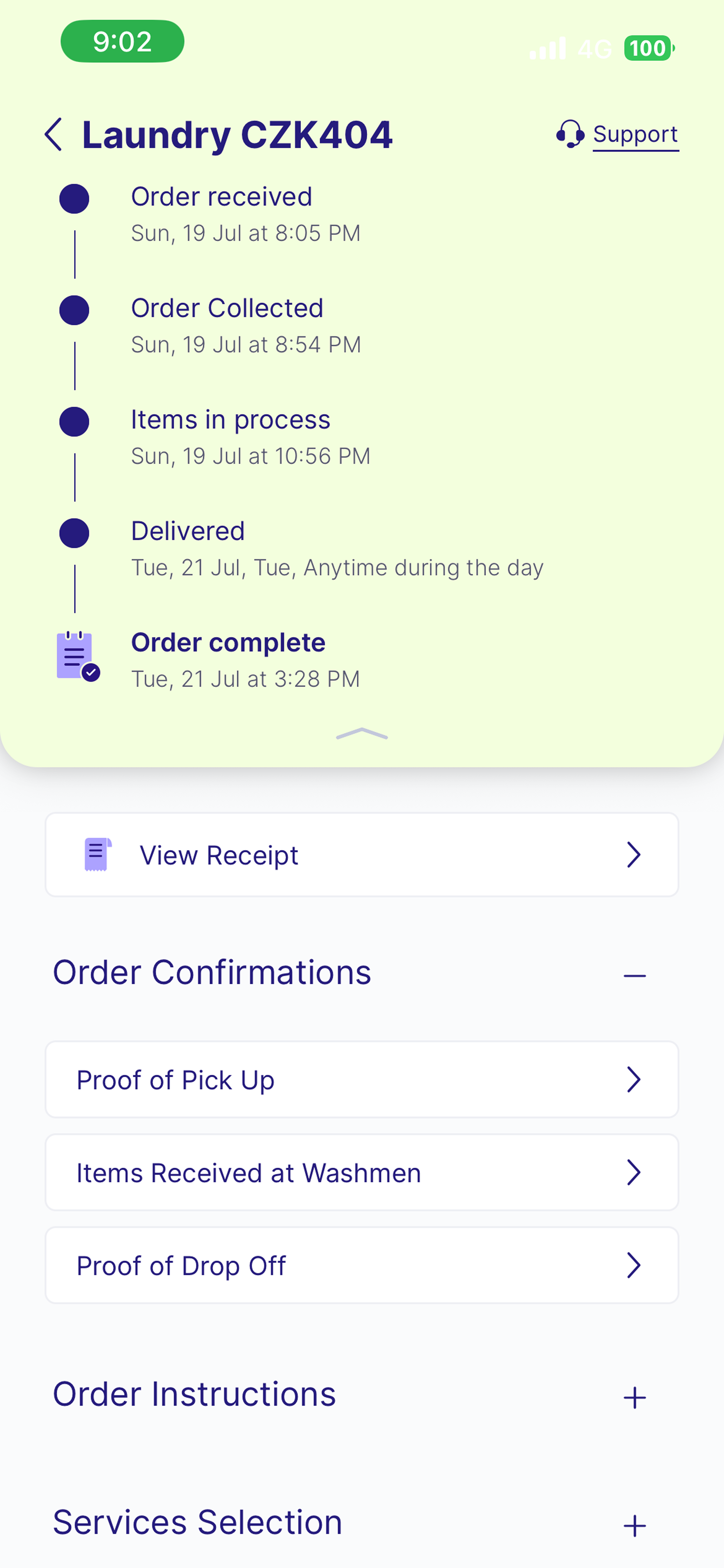
Legacy screens
Bringing the Facility to Life
The most significant opportunity was transforming the facility from a black box into an understandable experience.
Instead of showing a single "In Progress" state, customers can now follow individual garments throughout the cleaning process, with visibility into:
- Items received
- Items are being cleaned
- Items cleaned
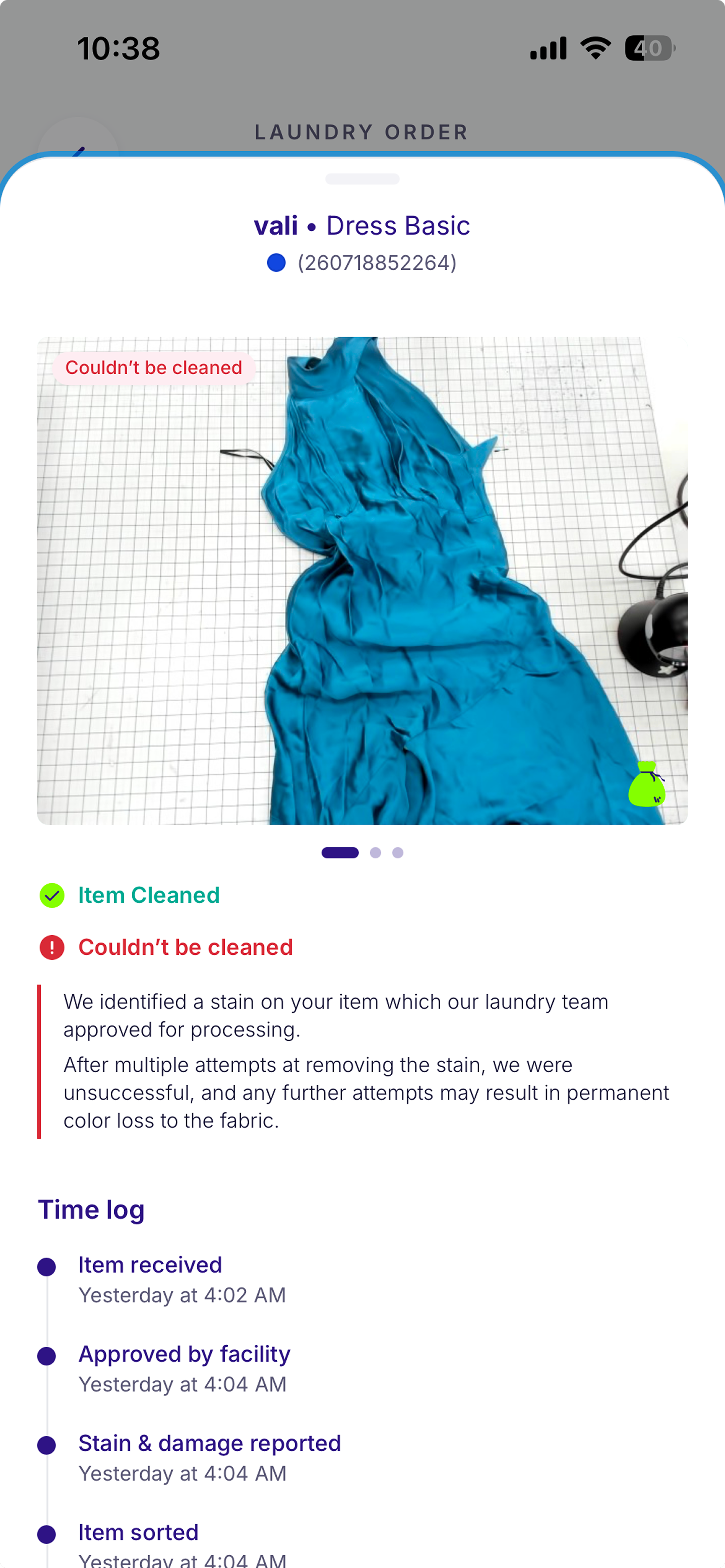
- Items returned uncleaned
- Items that may be delayed
- Delayed items
Every garment includes:
- timestamped activity logs;
- photos;
- facility notes;
- issue reports;
- damage assessments; and
- explanations when an item cannot be cleaned.
For orders requiring customer approval, the system surfaces clear next steps and routes customers into the appropriate approval flow. Once a decision is made, the experience updates dynamically, returning the order to processing or moving it into the next operational state.
The objective wasn't simply to expose more operational data; it was to translate invisible processes into experiences customers could understand and trust.
Building the Experience
Beyond defining the product architecture, I rebuilt the front end in Lovable as part of Washmen's migration toward AI-assisted development.
I refined interactions directly in the build, optimizing:
- transitions;
- bottom-sheet behavior;
- motion and feedback;
- loading states; and
- status animations
The goal was to create an experience that felt native and responsive, rather than a web view layered inside an app.
Once complete, I handed the implementation to engineering to wire the API connections and connect every component to its underlying data source.
The Outcome
The result transformed an invisible operational workflow into an experience customers can follow, understand, and trust.
Customers can now:
- track orders from pickup to drop-off;
- monitor individual garments inside the facility;
- receive proactive updates about delays and exceptions;
- approve or reject services directly within the experience; and
- understand exactly what is happening to their items at any moment.
The goal was never to expose operational complexity for its own sake. It was to replace uncertainty with confidence, reduce support dependency, and create transparency around a process customers previously couldn't see.
Beyond the core journey, individual features I have designed and shipped:
Selected Features
Shoe & Bag Approval Flow
Replacing a Manual Approval Process with a Structured In-App Experience
Role: Lead Product Designer
Scope: Facility research and workflow discovery, CX stakeholder research, Service approval journey design, UX strategy and information architecture, UI and interaction design, Product specifications, Cross-functional collaboration,QA validation and iteration
Tools: Figma
Platform: Washmen customer app
Process: Traditional agile, design to engineer handoff
Shoe & Bag Care is a high-touch service where every item requires individual assessment. The condition of each piece varies, the recommended treatment depends on what the item needs, and pricing cannot be determined until the facility has inspected it.
The Approval Flow was designed to give customers control over these decisions by allowing them to review recommended services and pricing for each item individually before any work begins.
The goal was to replace an inconsistent manual approval process with a structured experience that worked for customers, CX, and facility operations.
The Challenge
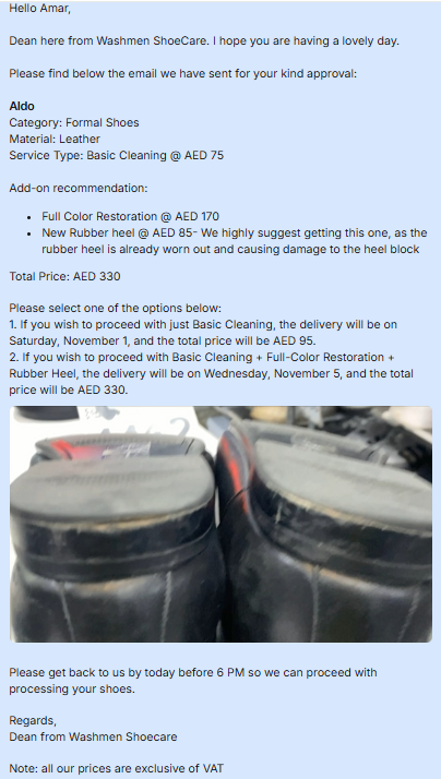
Before this flow existed, the approval process was managed manually through WhatsApp.
Once items were assessed, CX teams communicated recommended services and pricing to customers, collected approvals, and relayed decisions back to the facility. This created several challenges:
Customer decisions relied on manual communication
Customers had no structured way to understand what was recommended for each item, why it was needed, or how much each service would cost. Decisions were handled through fragmented conversations, making it difficult to review and approve items confidently.
CX needed consistency in service recommendations and pricing
Because approvals were handled case by case, CX teams had to manually communicate pricing and recommendations, making consistency harder to maintain across customers and orders.
The challenge was creating one experience that balanced three different needs:
- customers needed transparency and control;
- CX needed a consistent process for communication and pricing.
The Approach
Researching the Operational Workflow
This project was research-led and required understanding the process beyond the customer interface.
I visited the facility multiple times to understand the operational workflow firsthand, from item intake and assessment through processing. I interviewed the facility team to uncover their pain points, understand the challenges around customer approvals, and identify where manual decisions and handoffs were creating friction.
I also partnered with CX to understand how service recommendations, approvals, and pricing were communicated to customers. These insights helped identify opportunities to create a more structured and consistent approval experience across customers, CX, and facility operations.
Creating a Clear Item-Level Approval Experience
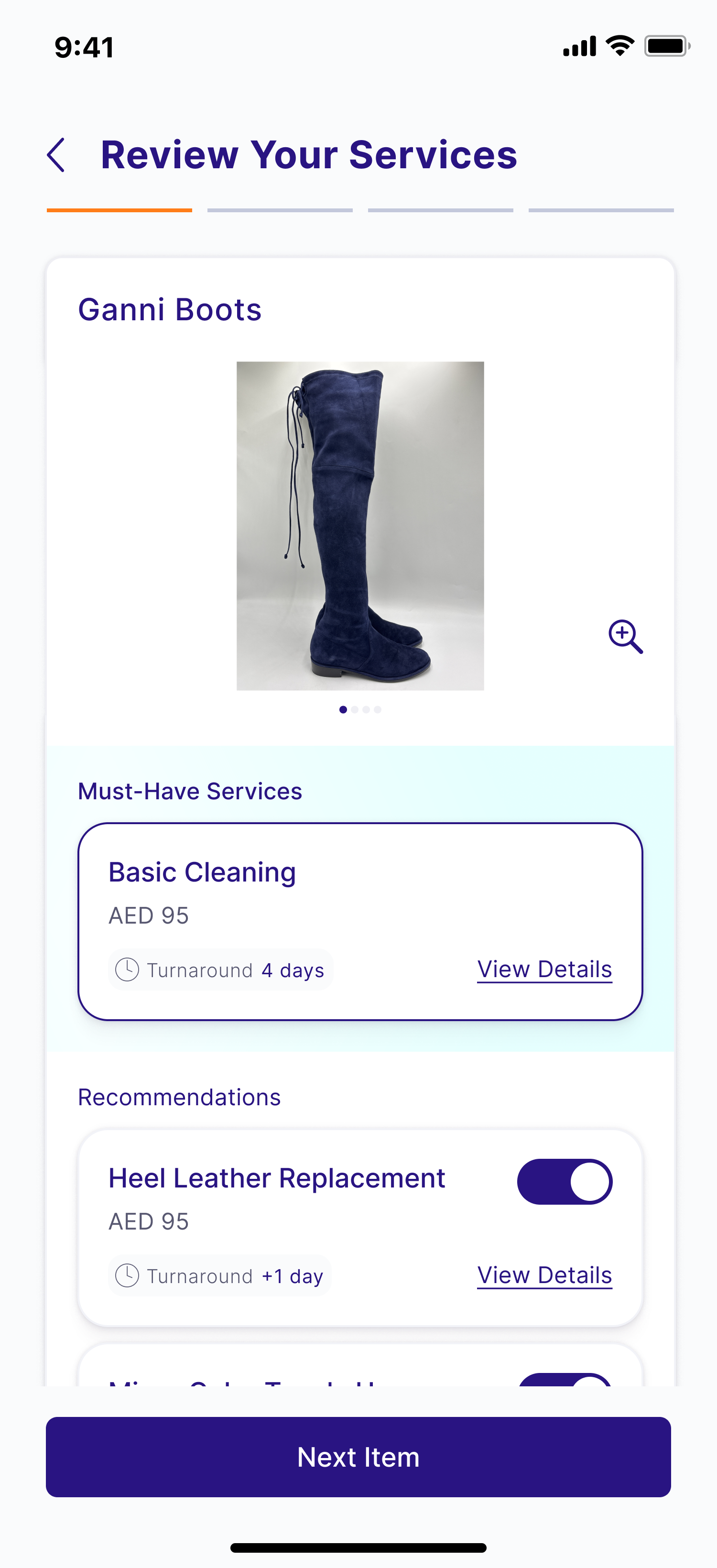
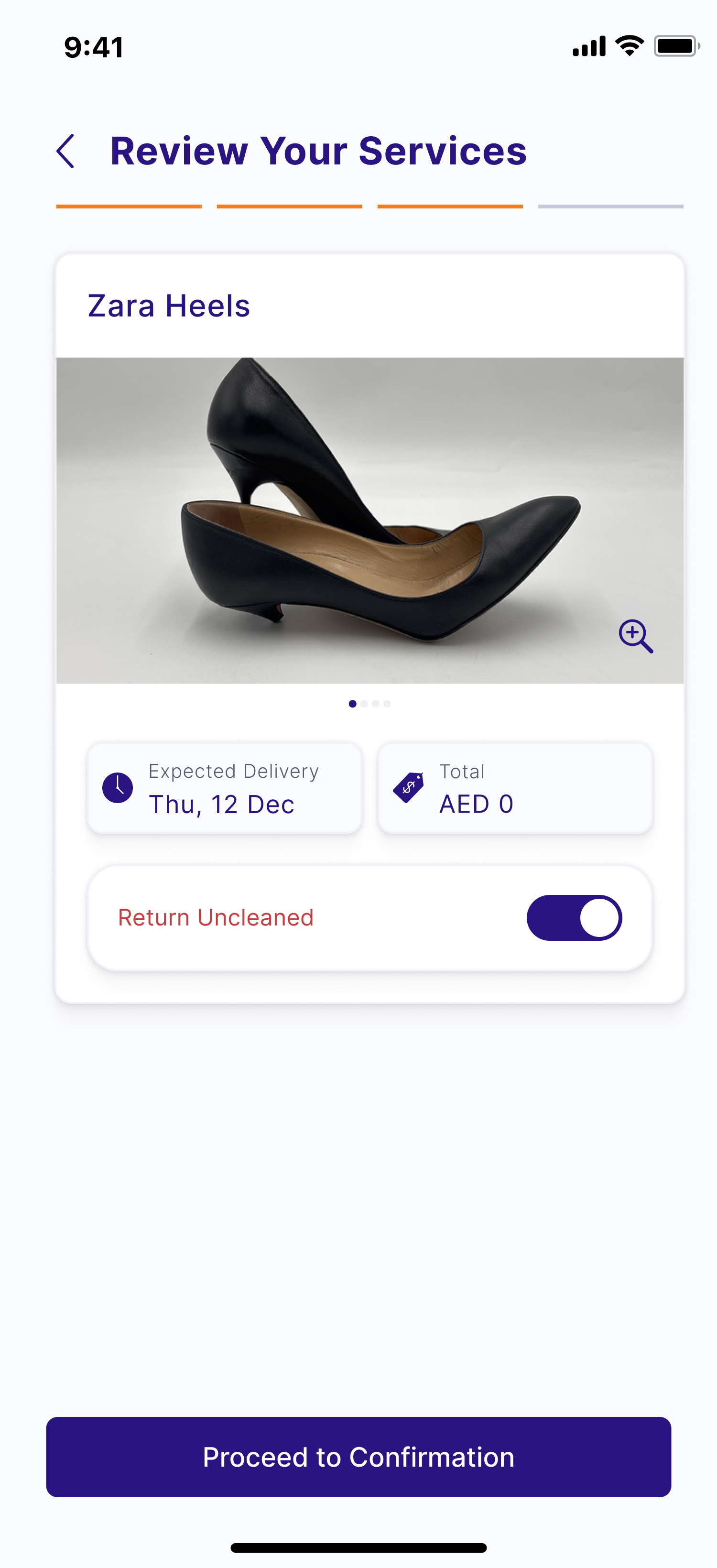
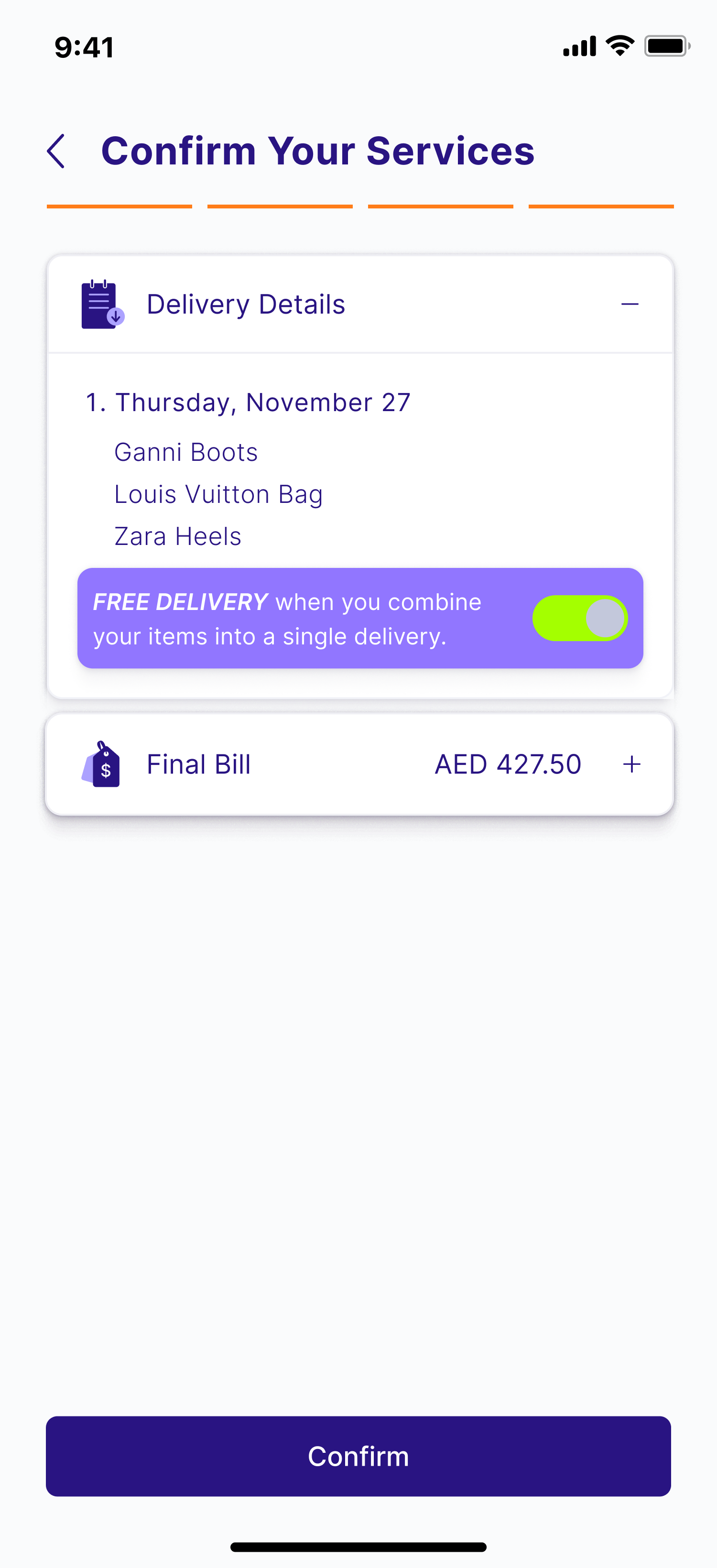
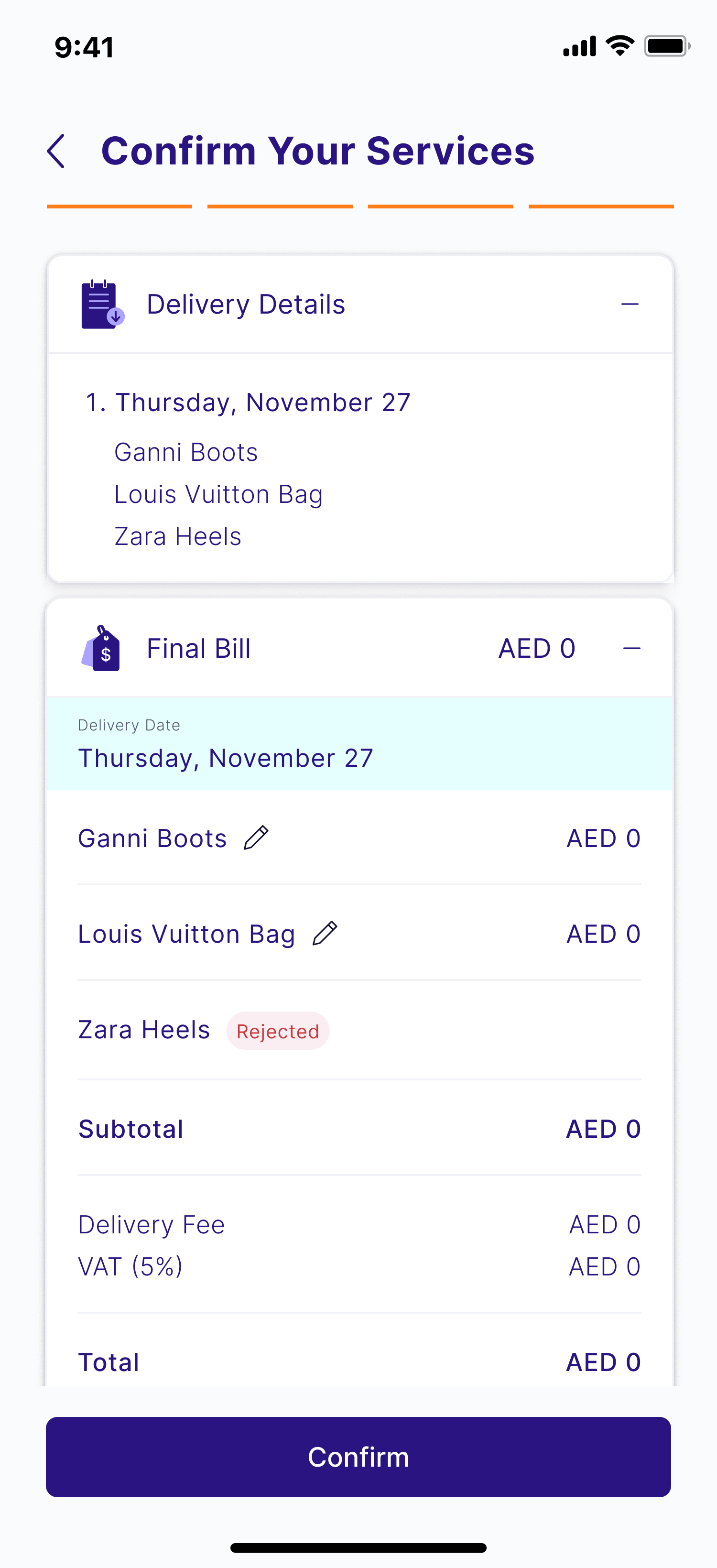
The flow begins once the facility completes its assessment and recommends services for each item.
Instead of presenting customers with an all-or-nothing decision, the experience allows them to review and approve items individually.
For each item, customers can understand:
- what service is recommended;
- the associated cost;
- which items require approval; and
- what happens after they make their decision.
This gives customers control over each piece while allowing the facility to proceed only with approved services.
The Outcome
The Approval Flow replaced an inconsistent WhatsApp-based process with a structured, self-service experience.
Customers gained transparency and control over how their items were treated, while CX and facility teams gained a clearer, more reliable workflow.
The experience created alignment between customer expectations and operational execution, reducing manual coordination, improving visibility, and making a high-touch service feel more predictable.
Wash & Fold+
Introducing a Premium Preference Into a High-Volume Ordering Experience
Role: Lead Product Designer
Scope: Problem definition and opportunity framing, UX strategy and interaction design, Product specifications and user stories (Given/When/Then), QA testing, and UI Design
Tools: Figma
Platform: Washmen customer app
Process: Traditional agile, design to engineer handoff
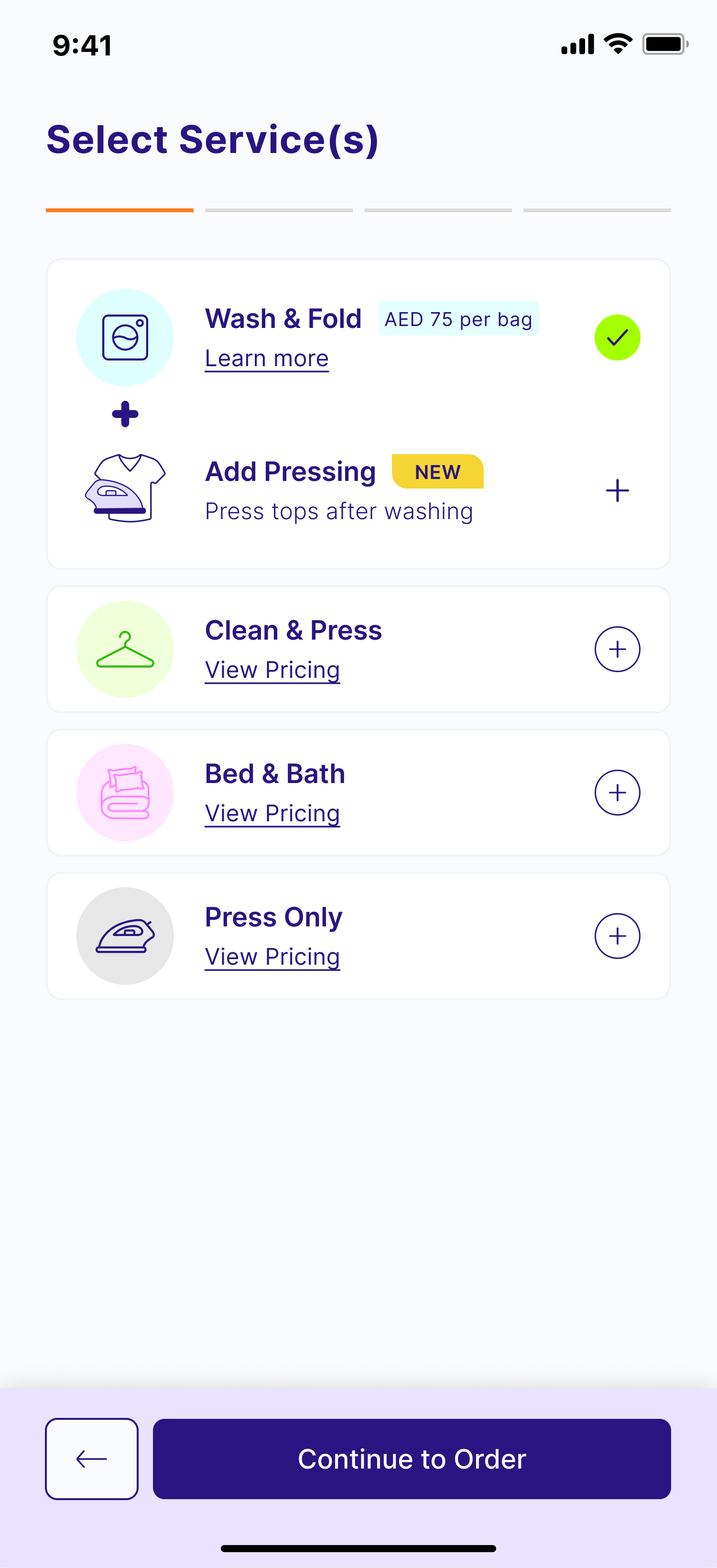
Wash & Fold is Washmen's highest-volume service, designed to provide the fastest and simplest way for customers to send everyday laundry.
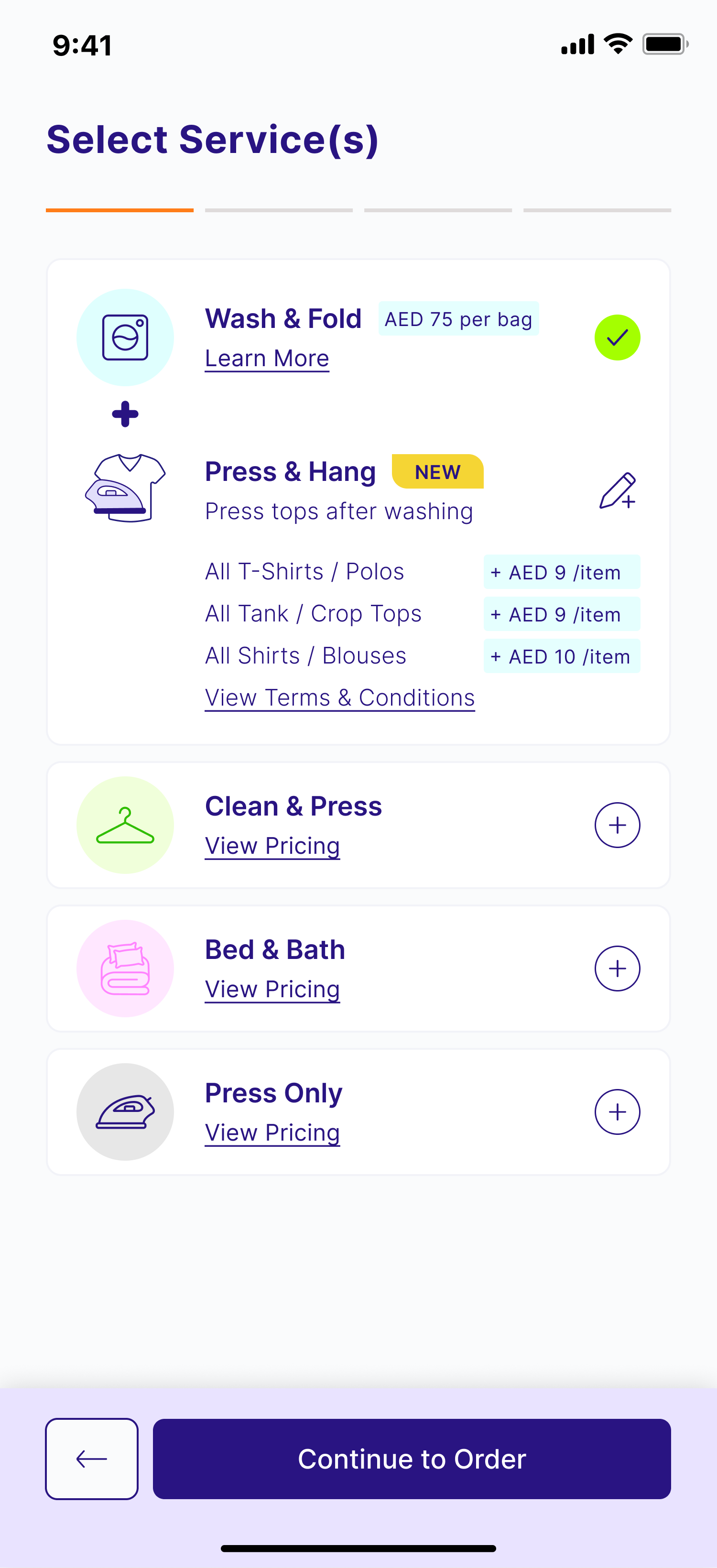
Wash & Fold+ introduced an optional Press & Hang upgrade, allowing customers to select specific garments to be professionally pressed and hung while the remainder of their order continued through the standard Wash & Fold service.
The challenge was not simply designing an upsell, it was introducing additional choice into a flow intentionally optimized for speed, while preserving the simplicity that makes the service successful.
The Challenge
Wash & Fold succeeds because it minimizes effort. Customers can place an order quickly without making unnecessary decisions.
Introducing an optional premium service risked disrupting that experience.
The upgrade needed to:
- feel like a natural extension of the existing flow rather than an interruption;
- clearly communicate which garments were eligible;
- explain the additional cost at the point of decision; and
- maintain the speed and simplicity expected from Wash & Fold.
There was an additional product challenge around pricing.
Like the rest of Washmen, final pricing is confirmed only after garments have been assessed at the facility. Introducing an optional paid preference meant customers needed immediate clarity on what they were adding, despite the broader pricing model being assessment-based.
My Approach
Integrating the Upgrade Into Existing Customer Decisions
Rather than presenting Press & Hang as a separate service, I introduced it as an optional preference within the existing Wash & Fold journey.
The upgrade is surfaced during service selection, when customers are already deciding which services they would like added to their order. This kept the interaction contextual instead of introducing an additional decision later in the checkout flow.
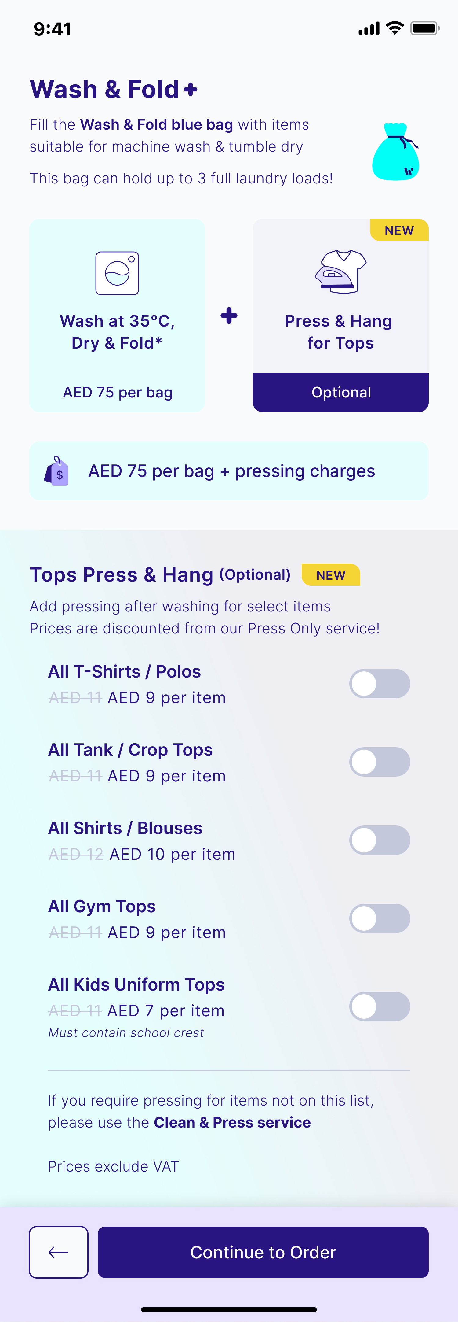
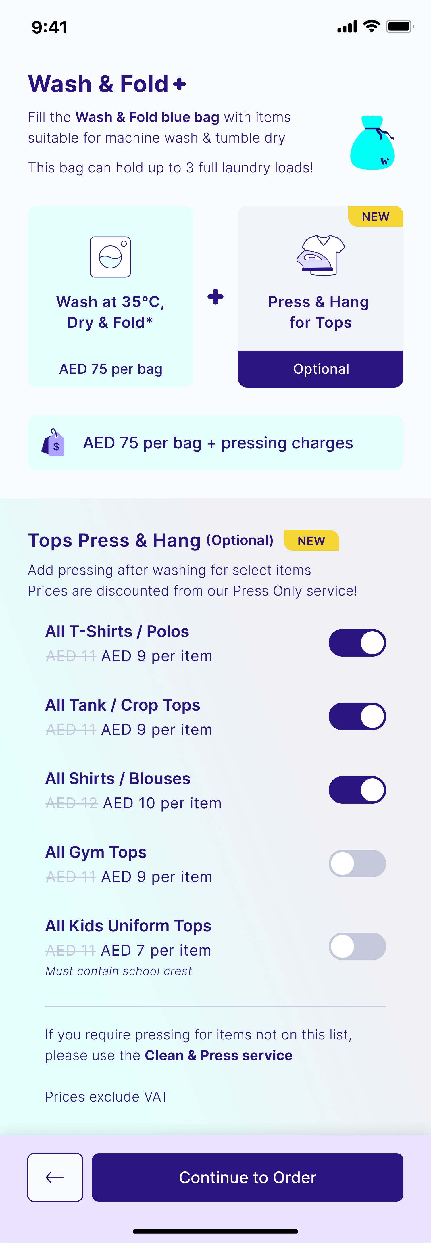
Only eligible garment types are presented, with pricing displayed inline so customers can understand the additional cost of the upgrade per item before making their selection.
This created a deliberate moment of pricing clarity within an otherwise deferred-pricing experience.
Keeping the Experience Lightweight
A key design principle was ensuring the upgrade never slowed down customers who didn't want it.
Preferences save immediately as customers make their selections, removing unnecessary confirmation steps and keeping the interaction lightweight.
For first-time use, I also designed the Terms & Conditions acknowledgement, ensuring customers understood the service while avoiding unnecessary friction for future orders.
The result is an experience that adds flexibility without increasing cognitive load for the majority of customers who simply want to place a quick Wash & Fold order.
Designing Beyond the Interface
Because the project was delivered through a traditional engineering workflow, my role extended beyond UX and UI.
I authored detailed product specifications and Given/When/Then user stories covering every interaction, state, and edge case, ensuring implementation requirements were unambiguous for engineering and QA.
Throughout development, I partnered closely with the team to validate implementation, conducted QA in TestFlight, and ensured the shipped experience accurately reflected the intended design.
The Outcome
Wash & Fold+ introduced a premium upsell without compromising the speed and simplicity of Washmen's highest-volume service.
Customers can now upgrade eligible garments with a single interaction, understand the additional cost before committing, and personalize how specific items are cared for without moving their entire order into a separate service line.
By integrating the upgrade into an existing customer decision rather than creating a new journey, the experience adds value for customers who want a premium finish while remaining invisible to those who don't.